The Editor
The Silex editor is organized into zones: a central canvas where you design, a left sidebar with tools, a right panel for styling, and a top toolbar for quick actions.
Understanding where to find each tool makes designing faster and more intuitive. This page is a guided tour.
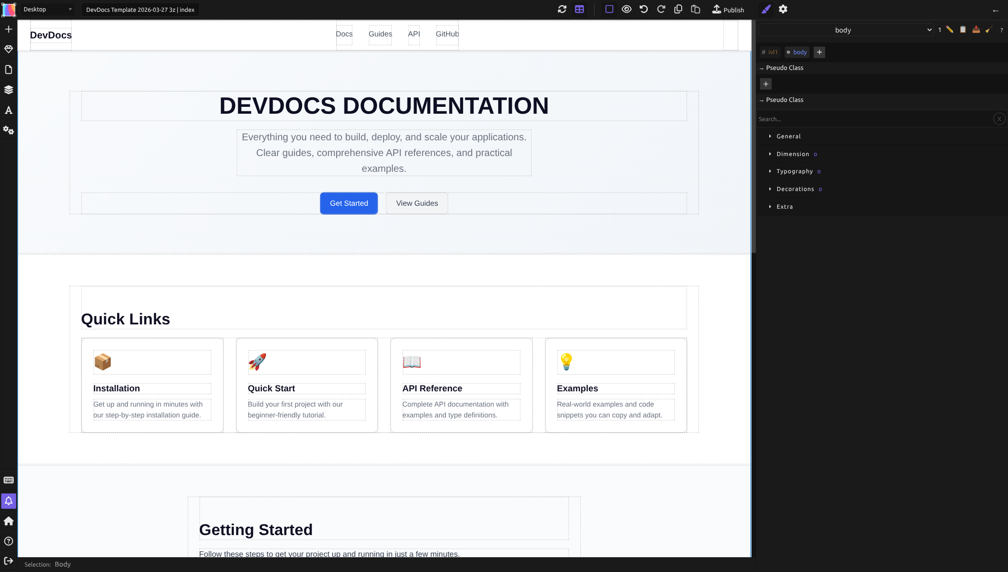
The canvas (center)
The large white area in the middle is the canvas — your design surface. Everything you create appears here.
What you can do: - Drag elements onto it from the left sidebar (Blocks, Symbols) - Click elements to select them (a blue outline appears) - Double-click text elements to edit content directly - Drag elements around to reposition them - Use the top toolbar to preview on different device sizes
The canvas shows your page in real time. As you adjust colors, spacing, or layout in the right panel, changes appear instantly.
The left sidebar
The left sidebar is a vertical strip of icon buttons. Click an icon to open its panel or trigger its action. From top to bottom:
| Button | Shortcut | Description |
|---|---|---|
| + (Add element) | Quick-add menu for inserting elements | |
| Blocks | Shift+A | Draggable HTML elements |
| Symbols | Shift+S | Reusable components |
| Pages | Shift+P | Page list and management |
| Layers | Shift+L | Element tree for the current page |
| Fonts | Alt+F | Font management |
| CSS Variables | CSS custom properties | |
| Settings | Alt+S | Site and page settings dialog |
| Keyboard Shortcuts | Shift+H | Shortcut reference |
| Notifications | Shift+N | Messages, errors, progress |
| Dashboard | Return to the project list | |
| Documentation | Opens the Silex documentation | |
| Sign out | Logs you out of Silex |
Blocks
The Blocks panel holds all available elements organized into categories:
- Basics: Text, Container
- Media: Image, Video
- Components: Map, Custom Code
- Forms: Form, Input, Textarea, Select, Button, Label, Checkbox, Radio
- Eleventy: Shortcode, select, option (for build awesome integration)
To add an element: drag it from the Blocks panel onto the canvas. To change an element's HTML tag (e.g., turn a Text block into an H1 heading), select it and change the Tag name in the Element settings (gear icon in the right panel).
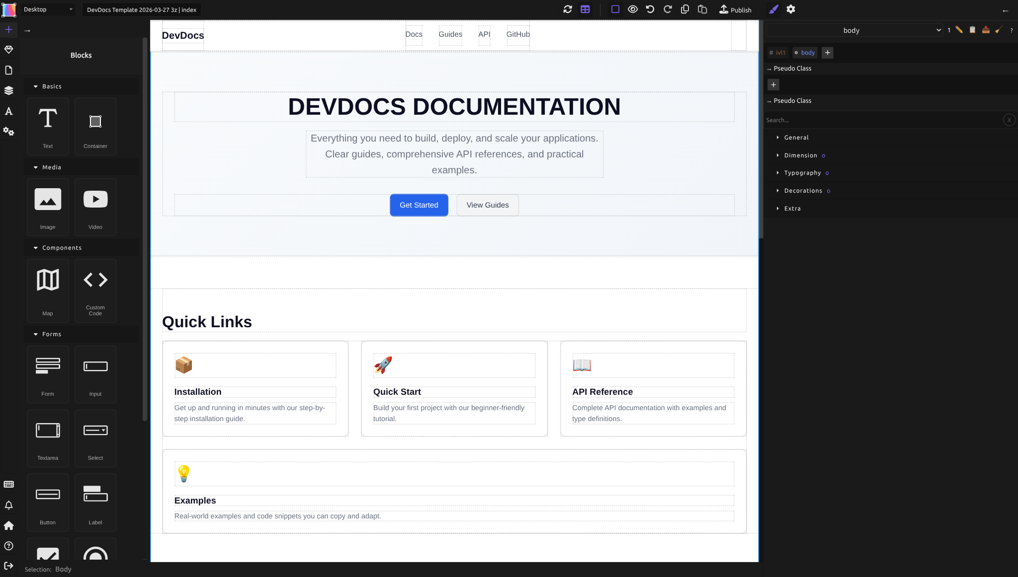
Each block comes with sensible defaults (a text block has padding, a container has a minimum height), so you don't start from scratch.
Symbols
Symbols are reusable components. Once you've created a Symbol (like a reusable header or footer), instances of that Symbol appear here. You can drag them onto any page, and changes to the Symbol update all instances at once.
Learn more in Symbols.
Pages
Lists all pages in your website. Click a page name to switch to it. Click + to create a new page. Each page row has action icons: delete, clone, and settings.
Your homepage must be named index — this is a standard web convention.
Layers
The layers panel shows a tree view of all elements on the current page — every Div, heading, image, and text block, nested as they appear in the HTML.
Use this panel when:
- Your page is crowded and clicking elements is hard — click the element name in Layers instead
- You want to understand the structure (which elements are inside which containers)
- You want to select an element's parent without clicking multiple times
Expand and collapse elements to see their children. The tree structure matches your HTML hierarchy.
Fonts
Manages font families for your site. Click + Add font to import a font (from Google Fonts or upload your own). Once added, the font appears in the Typography section of the Style Manager when you select text.
CSS Variables
Stores and manages CSS custom properties (variables). Create a variable like --primary-color: #007bff, and use it throughout your site. Change the variable once, and every element using it updates.
Learn more in CSS Variables.
Settings
Opens the site and page settings dialog. Here you configure:
- Site settings: website name, language, favicon, SEO metadata, custom code (like Google Analytics)
- Page settings: page title, URL slug, per-page SEO overrides
Settings apply to your entire website or to a single page depending on which tab you're on.
Keyboard shortcuts
Displays a list of all keyboard shortcuts available in the editor. This is a reference panel — use it to learn shortcuts like Shift+A (Blocks), Shift+L (Layers), Ctrl+Z (Undo), Ctrl+C/V (Copy/Paste).
Notifications
Displays messages from Silex: upload progress, publish status, errors, or warnings. If something goes wrong (like a style conflict), you'll see it here.
The right panel
The right panel has two views, toggled by the icons at the top right:
- Style Manager (paint brush icon) — CSS properties for the selected element
- Element settings (gear icon) — HTML attributes, tag name, link settings, and CMS data bindings (States, Attributes, Properties)
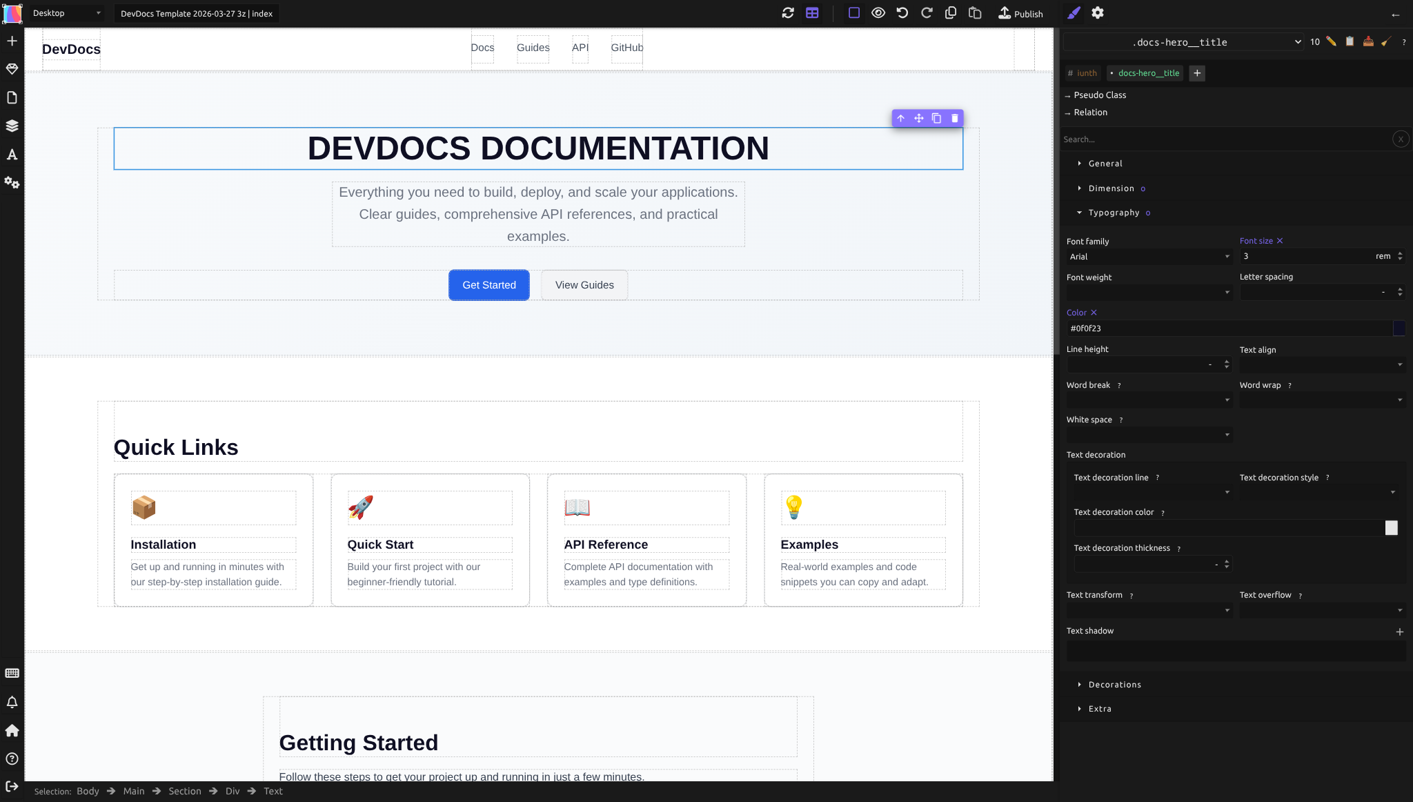
Style Manager
This is where you control the visual appearance of selected elements using CSS.
When you select an element, the Style Manager shows relevant properties organized into sections:
- General — layout mode (Flex, Block), display, position, overflow
- Flex — flex container and item properties (direction, wrap, justify, align, gap)
- Dimension — width, height, min/max sizes, margin, padding
- Typography — font family, size, weight, line height, color, text alignment
- Decorations — background, borders, border-radius, box-shadow, opacity
- Extra — transforms, filters, transitions, and other advanced properties
Every property you see here is standard CSS. Adjust values and see the result on the canvas immediately.
Element settings
Click the gear icon at the top of the right panel (or select an element and press the gear) to see:
- ID — the element's unique identifier
- Title — an optional label for the element
- Tag name — change the HTML tag (e.g., DIV → H1, SECTION, NAV, HEADER, FOOTER, etc.)
- Link — make the element a link (URL, email, or internal page)
- Unwrap content — remove the wrapper but keep the content inside
Below the component traits, you'll find the CMS data sections (if a data source is connected):
- States — reusable named expressions that expose data to child components
- Attributes — bind HTML attributes (href, src, alt) to dynamic data
- Properties — bind innerHTML, visibility conditions, and loop data
Learn more in CMS and Data.
The top toolbar
The toolbar at the very top of the editor contains quick actions.
Device preview
A dropdown showing different screen sizes: Desktop, Tablet, Mobile Landscape, and Mobile Portrait. Select one to preview your design on that device. The canvas resizes to match the breakpoint, so you see how your layout looks on smaller screens.
This doesn't change your design — it's purely a preview tool. To make your site responsive, you adjust styles at different breakpoints (see Responsive design).
Undo / Redo
Buttons to undo and redo your recent actions. Keyboard shortcuts work too: Cmd+Z (Mac) or Ctrl+Z (Windows) to undo, Cmd+Shift+Z / Ctrl+Shift+Z to redo.
Publish
The Publish button commits your design to your site's Git repository and triggers the publication pipeline. Your site is then rebuilt and deployed to your hosting (GitLab Pages, FTP, etc.).
Click this when you're ready to go live — or to push updates to a live site.
Common workflow
Here's how designers typically use these panels together:
- Left sidebar, Blocks panel: Drag elements onto the canvas
- Canvas: Click to select an element
- Right panel, Style: Adjust the element's appearance
- Left sidebar, Layers: Find elements in complex layouts
- Top toolbar, Device preview: Test responsiveness
- Top toolbar, Publish: Go live
The beauty of this layout is that everything you need for a task is visible. You don't click deep into dialogs or hunt for options.
Tips for efficiency
- Use Layers to navigate complex structures. If your page has many nested Divs, clicking in Layers is faster than clicking on the canvas.
- Set defaults for new elements. Silex gives new blocks sensible padding and spacing by default, so you spend less time adjusting basics.
- Pin the Style Manager. If you're making lots of styling changes, keep the Style tab open in the right panel — you don't have to keep clicking back to it.
- Use keyboard shortcuts. Open the Keyboard Shortcuts panel (left sidebar) and learn the ones you use most (Duplicate, Copy, Paste, Select All).
- Symbols for repeating patterns. If you have a header or footer that appears on multiple pages, make it a Symbol once — update it in one place, and all pages reflect the change.
What's not in the toolbar
A few things to know about what you won't find in the interface (by design):
- No animations or interactions. Silex doesn't include timeline-based animations or scroll-triggered effects. You can style hover/focus states via CSS pseudo-classes in the selector system. Vote for Interaction Designer on the roadmap to support animations and interactions.
- No ecommerce tools. Silex is for content and marketing sites, not online stores with shopping carts. (Ecommerce is not a current focus.)
- No drag-to-reorder in all panels. The Blocks and Symbols panels don't support drag-to-favorite — all elements are always available.
Missing a feature? Check the roadmap to vote or propose ideas. You can also contribute to help build what's missing. Interested in AI-powered editing? Vote for Bring Your Own AI Key to use your own API key for AI features.
Quiz
Q1: You're on a complex page with 20 nested elements and clicking on the canvas is difficult. Where do you go?
- A) Left sidebar, Layers panel — click the element name in the tree
- B) Right panel, Traits — search for the element
- C) Top toolbar, Device preview
Answer
A) Left sidebar, Layers panel — The Layers panel shows a tree of all elements, making it easy to select specific items without clicking on the canvas.
Q2: You want to change the background color of your page. Where do you go?
- A) Left sidebar, Settings
- B) Right panel, Style tab, then Background
- C) Top toolbar, Publish
Answer
B) Right panel, Style Manager, then Decorations section — All visual styling happens in the Style Manager. Background is under the Decorations section.
Q3: You want to preview how your site looks on a phone. What do you click?
- A) Left sidebar, Blocks — filter by "Mobile"
- B) Right panel, Traits
- C) Top toolbar, Device preview — select Mobile Portrait
Answer
C) Top toolbar, Device preview — Select Mobile Portrait to see your design at phone width. This is a preview-only tool; it doesn't change your design.
Q4: You create a reusable header that appears on every page. Where do you store it so you can reuse it?
- A) Left sidebar, Symbols panel
- B) Left sidebar, Blocks panel
- C) Right panel, Data tab
Answer
A) Left sidebar, Symbols panel — Create a Symbol once, then drag instances of it onto other pages. Changes to the Symbol update all instances.
Q5: You want to connect your WordPress blog to Silex and display blog posts on your site. Where is that panel?
- A) Right panel, Data tab (Data Sources)
- B) Left sidebar, Blocks panel
- C) Top toolbar, Publish
Answer
A) Right panel, Data tab — The Data Sources panel is where you connect CMS APIs and bind component states to data fields.