Attributs et rôles ARIA
ARIA (Accessible Rich Internet Applications) est un ensemble d'attributs HTML qui ajoutent du sens pour les technologies d'assistance. ARIA ne change ni l'apparence ni le comportement d'un élément -- il change la façon dont les lecteurs d'écran l'annoncent.
Deux principes directeurs :
- La première règle d'ARIA : n'utilisez pas ARIA si du HTML natif peut faire le travail. Un
<button>est déjà annoncé comme un bouton. Ajouterrole="button"à un<div>est un contournement, pas une solution -- utilisez plutôt<button>. - ARIA est une promesse. Si vous ajoutez
role="button"à un élément, vous promettez qu'il se comporte comme un bouton (accessible au clavier via le focus, activable avec Entrée et Espace). Si ce n'est pas le cas, vous avez dégradé l'accessibilité, pas amélioré.
Quand vous avez besoin d'ARIA
Le HTML natif couvre la plupart des cas. Vous avez besoin d'ARIA quand :
- Vous avez plusieurs repères (landmarks) du même type et devez les distinguer (par exemple, deux éléments
<nav>) - Vous voulez étiqueter un élément qui n'a pas de texte visible (par exemple, un bouton composé uniquement d'une icône)
- Vous devez masquer du contenu décoratif aux lecteurs d'écran
- Vous construisez des widgets interactifs personnalisés qui n'ont pas d'équivalent HTML
- Vous voulez associer des descriptions à des éléments (par exemple, des messages d'erreur avec des champs de formulaire)
Ajouter des attributs ARIA dans Silex
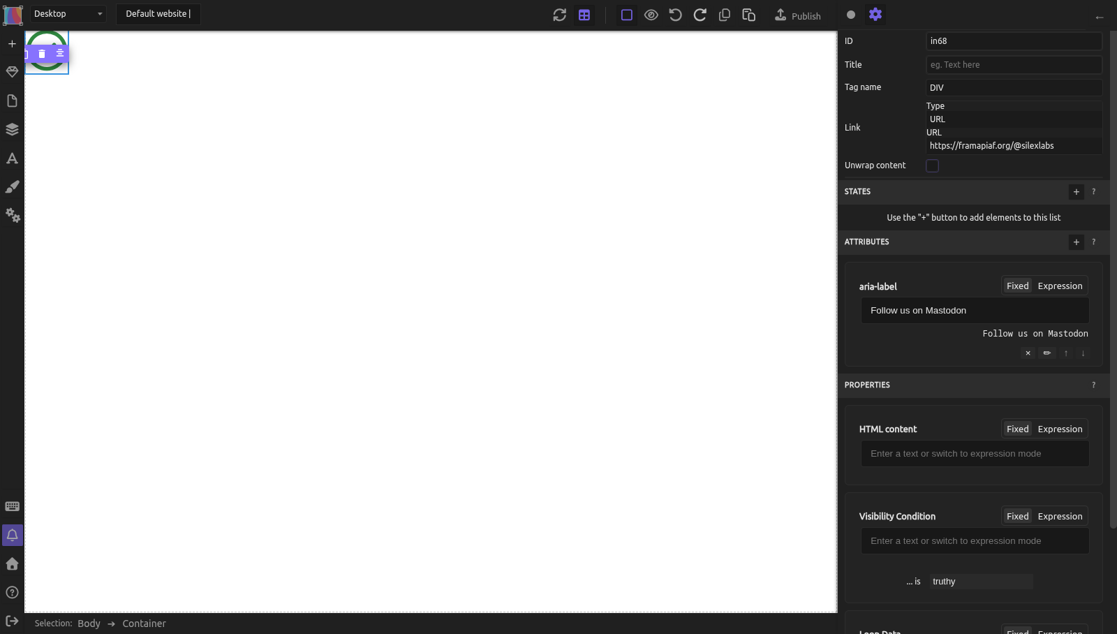
Silex vous permet d'ajouter n'importe quel attribut HTML à n'importe quel élément via la section Attributes des réglages de l'élément (icône engrenage en haut du panneau de droite) :
- Sélectionnez l'élément
- Ouvrez les réglages de l'élément (icône engrenage)
- Faites défiler jusqu'à la section Attributes (sous States et au-dessus de Properties)
- Cliquez sur le bouton +
- Saisissez le nom de l'attribut (par exemple,
aria-label) lorsqu'on vous le demande - Définissez la valeur -- soit une valeur fixe (saisie directe), soit une expression dynamique issue d'une source de données
Cela fonctionne pour tous les attributs ARIA, role, tabindex, les attributs data-* et tout autre attribut HTML. L'attribut est écrit dans le HTML publié, par ex. <a href="…" aria-label="Follow us on Mastodon">.
Attributs ARIA courants
aria-label
aria-label fournit un nom accessible à un élément lorsqu'il n'y a pas de texte visible.
Cas d'usage :
- Boutons avec icône uniquement : un bouton de menu hamburger sans texte visible.
- Ajoutez l'attribut :
aria-label=Open menu -
Le lecteur d'écran annonce : « Open menu, button »
-
Distinguer plusieurs repères : deux éléments
<nav>sur la même page. - Nav principale :
aria-label=Primary navigation - Nav du pied de page :
aria-label=Footer links -
Le lecteur d'écran liste : « Primary navigation, navigation » et « Footer links, navigation »
-
Formulaire de recherche : un champ de recherche sans label visible.
- Ajoutez au formulaire ou au champ :
aria-label=Search this site
N'utilisez pas aria-label quand un texte visible existe. Si un bouton affiche « Submit », aria-label est inutile -- le texte visible est déjà le nom accessible.
aria-hidden
aria-hidden masque un élément aux lecteurs d'écran tout en le laissant visible à l'écran.
Cas d'usage :
- Icônes décoratives à côté d'un texte (le texte transmet déjà le sens)
- Séparateurs visuels (lignes, formes décoratives)
- Contenu en double qui prêterait à confusion s'il était lu deux fois
Ajoutez l'attribut : aria-hidden = true
Attention : n'utilisez jamais aria-hidden="true" sur des éléments focusables (liens, boutons, champs). L'élément serait invisible pour les lecteurs d'écran tout en recevant le focus clavier, ce qui crée un élément « fantôme » déroutant.
aria-labelledby
aria-labelledby pointe vers l'id d'un autre élément qui sert de label.
Cas d'usage : une section avec un titre visible qui doit aussi être le nom accessible du repère.
- Sélectionnez le titre, ajoutez l'attribut :
id=features-heading - Sélectionnez la section, ajoutez l'attribut :
aria-labelledby=features-heading - Le lecteur d'écran annonce : « Features, region » (en utilisant le texte du titre comme nom)
C'est préférable à aria-label quand un texte de label visible existe déjà -- cela évite la duplication et reste synchronisé si le texte change.
aria-describedby
aria-describedby pointe vers l'id d'un élément qui fournit une description supplémentaire.
Cas d'usage : un champ de formulaire avec un message d'erreur ou un texte d'aide.
- Ajoutez un élément texte : « Must be at least 8 characters. » Donnez-lui
id=password-help - Sur le champ de mot de passe, ajoutez :
aria-describedby=password-help - Le lecteur d'écran annonce : « Password, edit text. Must be at least 8 characters. »
Voir Formulaires accessibles pour en savoir plus sur les messages d'erreur de formulaire.
aria-live
aria-live annonce les changements de contenu dynamiques aux lecteurs d'écran. Quand le contenu à l'intérieur d'une région aria-live change, le lecteur d'écran énonce le nouveau contenu.
Valeurs :
| Valeur | Comportement |
|---|---|
polite |
Attend que le lecteur d'écran termine son annonce en cours, puis énonce la mise à jour |
assertive |
Interrompt immédiatement le lecteur d'écran. À utiliser avec parcimonie -- uniquement pour les messages urgents |
off |
Aucune annonce (valeur par défaut) |
Cas d'usage : une confirmation d'envoi de formulaire qui apparaît dynamiquement.
- Sélectionnez le conteneur où le message de confirmation apparaîtra
- Ajoutez l'attribut :
aria-live=polite - Quand le contenu du message change (par exemple, « Thank you, your message has been sent »), le lecteur d'écran l'annonce
role
L'attribut role remplace ou ajoute un sens sémantique. La plupart du temps, vous devriez plutôt utiliser des balises HTML sémantiques.
| Au lieu de... | Utilisez... |
|---|---|
<div role="button"> |
<button> (sélecteur Tag Name) |
<div role="navigation"> |
<nav> (sélecteur Tag Name) |
<div role="main"> |
<main> (sélecteur Tag Name) |
<div role="heading" aria-level="2"> |
<h2> (sélecteur Tag Name) |
Cas où role est approprié :
role="presentation"ourole="none"-- retirer le sens sémantique d'un élément structurel (rare)role="tablist",role="tab",role="tabpanel"-- pour des interfaces à onglets personnalisées construites en JavaScriptrole="alert"-- équivalent àaria-live="assertive"pour les messages urgents
Exemple pratique : liens vers les réseaux sociaux en icônes seules
Vous avez une rangée d'icônes de réseaux sociaux (images SVG) qui pointent vers vos profils. Il n'y a pas de texte visible -- seulement des icônes.
- Pour chaque lien :
- Déposez un Container, déposez une Image dedans, puis sélectionnez le Container et réglez son Link (Type URL) dans les réglages de l'élément : le Container devient un
<a>qui entoure l'image. Déposez l'image d'abord : une fois devenu lien, un Container vide est un élément en ligne sans taille, et on ne peut plus rien y déposer - L'image est décorative (c'est le lien qui compte), laissez donc son champ Alt vide. Silex n'écrit alors aucun attribut
alt(un attributaltvide ajouté dans Attributes est supprimé à la publication) ; l'aria-hiddenci-dessous empêche les lecteurs d'écran d'annoncer l'image -
Sur l'élément Link, ajoutez
aria-labelvia la section Attributes :aria-label=Follow us on Mastodonaria-label=View our GitHub repositoryaria-label=Join our community chat
-
Sur chaque image d'icône :
-
Ajoutez
aria-hidden=true(l'aria-label du lien fournit déjà le nom) -
Résultat : le lecteur d'écran annonce « Follow us on Mastodon, link » pour chacun, en ignorant l'image décorative.
Erreurs courantes
- Utiliser ARIA quand le HTML fonctionne déjà. Ajouter
role="button"à un<button>est redondant. Ajouterrole="button"à un<div>au lieu d'utiliser<button>est une erreur -- le Div ne sera toujours pas focusable au clavier sans travail supplémentaire. - aria-hidden sur des éléments interactifs. Un bouton avec
aria-hidden="true"est invisible pour les lecteurs d'écran mais reste focusable -- une impasse déroutante. - aria-label qui duplique un texte visible. Si un bouton affiche « Submit », ajouter
aria-label="Submit"ne sert à rien. Pire, si vous changez plus tard le texte du bouton mais oubliez de mettre à jour aria-label, ils entreront en conflit. - Oublier qu'ARIA n'ajoute aucun comportement.
role="button"ne rend pas un élément focusable ni cliquable. Vous avez toujours besoin detabindex="0"et de gestionnaires d'événements clavier. C'est pourquoi le HTML natif est toujours préférable. - aria-live="assertive" partout. Assertive interrompt l'utilisateur. Utilisez
politepour la plupart des mises à jour. Réservezassertiveaux messages urgents comme les erreurs.
Pour aller plus loin
- MDN : ARIA -- référence ARIA complète
- MDN : aria-label -- attribut de nom accessible
- MDN : aria-hidden -- masquage aux lecteurs d'écran
- WAI-ARIA Authoring Practices -- modèles pour widgets personnalisés
- La première règle d'ARIA -- recommandation officielle sur quand utiliser ARIA
- Formulaires accessibles -- utiliser aria-describedby avec les champs de formulaire
- Navigation au clavier -- navigation par repères
Référence : attributs ARIA courants
| Attribut | Objectif | Valeurs courantes |
|---|---|---|
| aria-label | Nom accessible en l'absence de texte visible | N'importe quelle chaîne |
| aria-labelledby | Nom accessible issu du texte d'un autre élément | ID de l'élément qui étiquette |
| aria-describedby | Description supplémentaire | ID de l'élément qui décrit |
| aria-hidden | Masquer aux lecteurs d'écran | true, false |
| aria-live | Annoncer les changements dynamiques | polite, assertive, off |
| aria-required | Marquer un champ comme requis | true, false |
| aria-expanded | Indique si un élément repliable est ouvert | true, false |
| aria-current | Élément courant dans un ensemble | page, step, true |
| role | Remplacer le rôle sémantique | alert, tablist, tab, tabpanel, none |
Quiz
Q1 : Un lien de navigation utilise une icône SVG sans texte. Comment le rendre accessible ?
- A) Ajouter un texte
altau SVG - B) Ajouter
aria-labelau lien via la section Attributes - C) Ajouter
role="link"au SVG
Réponse
B) Ajouter aria-label au lien -- l'élément lien a besoin d'un nom accessible. aria-label le fournit en l'absence de texte visible. Les éléments SVG n'ont pas d'attribut alt (celui-ci est réservé à <img>).
Q2 : Vous avez un <div> avec role="button". Un utilisateur au clavier appuie sur Tab mais l'élément est ignoré. Pourquoi ?
- A) Le rôle est incorrect
- B) Le Div n'est pas focusable par défaut --
role="button"n'ajoute pas la focusabilité - C) Le navigateur ne prend pas en charge ARIA
Réponse
B) ARIA n'ajoute aucun comportement -- role="button" indique aux lecteurs d'écran que c'est un bouton, mais ne le rend ni focusable ni cliquable. Utilisez plutôt un élément <button> natif (sélecteur Tag Name).
Q3 : Vous ajoutez aria-hidden="true" à un bouton de fermeture dans une boîte de dialogue. Que se passe-t-il pour les utilisateurs de lecteur d'écran ?
- A) Le bouton est correctement masqué et ils utilisent Échap à la place
- B) Le bouton est invisible pour leur lecteur d'écran mais reçoit toujours le focus clavier, créant une impasse déroutante
- C) La boîte de dialogue se ferme automatiquement
Réponse
B) Le bouton est focusable mais invisible pour le lecteur d'écran -- c'est une combinaison dangereuse. N'utilisez jamais aria-hidden sur des éléments interactifs. Si vous voulez masquer quelque chose aux lecteurs d'écran, il faut aussi le retirer de l'ordre de tabulation.