ARIA attributes and roles
ARIA (Accessible Rich Internet Applications) is a set of HTML attributes that add meaning for assistive technologies. ARIA does not change how an element looks or behaves -- it changes how screen readers announce it.
Two guiding principles:
- The first rule of ARIA: do not use ARIA if native HTML can do the job. A
<button>is already announced as a button. Addingrole="button"to a<div>is a workaround, not a solution -- use<button>instead. - ARIA is a promise. If you add
role="button"to an element, you are promising that it behaves like a button (keyboard-focusable, activated with Enter and Space). If it does not, you have made accessibility worse, not better.
When you need ARIA
Native HTML covers most cases. You need ARIA when:
- You have multiple landmarks of the same type and need to distinguish them (e.g., two
<nav>elements) - You want to label an element that has no visible text (e.g., an icon-only button)
- You need to hide decorative content from screen readers
- You are building custom interactive widgets that have no HTML equivalent
- You want to associate descriptions with elements (e.g., error messages with form fields)
Adding ARIA attributes in Silex
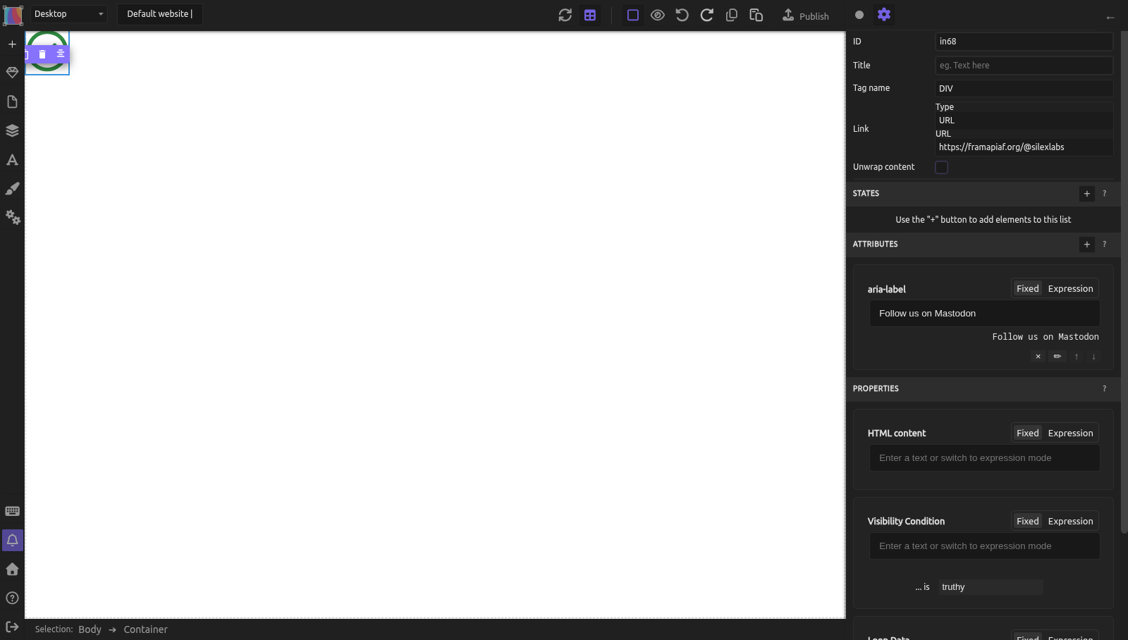
Silex lets you add any HTML attribute to any element through the Attributes section in the Element settings (gear icon at the top of the right panel):
- Select the element
- Open the Element settings (gear icon)
- Scroll to the Attributes section (below States and above Properties)
- Click the + button
- Enter the attribute name (e.g.,
aria-label) when prompted - Set the value -- either a fixed value (type it directly) or a dynamic expression from a data source
This works for all ARIA attributes, role, tabindex, data-* attributes, and any other HTML attribute. The attribute is written in the published HTML, e.g. <a href="…" aria-label="Follow us on Mastodon">.
Common ARIA attributes
aria-label
aria-label provides an accessible name for an element when there is no visible text.
Use cases:
- Icon-only buttons: A hamburger menu button with no visible text.
- Add attribute:
aria-label=Open menu -
Screen reader announces: "Open menu, button"
-
Distinguishing multiple landmarks: Two
<nav>elements on the same page. - Primary nav:
aria-label=Primary navigation - Footer nav:
aria-label=Footer links -
Screen reader lists: "Primary navigation, navigation" and "Footer links, navigation"
-
Search form: A search input with no visible label.
- Add to the form or input:
aria-label=Search this site
Do not use aria-label when visible text exists. If a button says "Submit," aria-label is unnecessary -- the visible text is already the accessible name.
aria-hidden
aria-hidden hides an element from screen readers while keeping it visible on screen.
Use cases:
- Decorative icons next to text (the text already conveys the meaning)
- Visual separators (decorative lines, shapes)
- Duplicate content that would be confusing if read twice
Add attribute: aria-hidden = true
Warning: Never use aria-hidden="true" on focusable elements (links, buttons, inputs). The element would be invisible to screen readers but still receive keyboard focus, creating a confusing "ghost" element.
aria-labelledby
aria-labelledby points to the id of another element that serves as the label.
Use case: A section with a visible heading that should also be the landmark's accessible name.
- Select the heading, add attribute:
id=features-heading - Select the section, add attribute:
aria-labelledby=features-heading - Screen reader announces: "Features, region" (using the heading text as the name)
This is preferred over aria-label when visible label text already exists -- it avoids duplication and stays in sync if the text changes.
aria-describedby
aria-describedby points to the id of an element that provides additional description.
Use case: Form field with an error message or help text.
- Add a text element: "Must be at least 8 characters." Give it
id=password-help - On the password input, add:
aria-describedby=password-help - Screen reader announces: "Password, edit text. Must be at least 8 characters."
See Accessible forms for more on form error messages.
aria-live
aria-live announces dynamic content changes to screen readers. When content inside an aria-live region changes, the screen reader speaks the new content.
Values:
| Value | Behavior |
|---|---|
polite |
Waits until the screen reader finishes its current announcement, then speaks the update |
assertive |
Interrupts the screen reader immediately. Use sparingly -- only for urgent messages |
off |
No announcements (default) |
Use case: A form submission confirmation that appears dynamically.
- Select the container where the confirmation message will appear
- Add attribute:
aria-live=polite - When the message content changes (e.g., "Thank you, your message has been sent"), the screen reader announces it
role
The role attribute overrides or adds semantic meaning. Most of the time, you should use semantic HTML tags instead.
| Instead of... | Use... |
|---|---|
<div role="button"> |
<button> (Tag Name selector) |
<div role="navigation"> |
<nav> (Tag Name selector) |
<div role="main"> |
<main> (Tag Name selector) |
<div role="heading" aria-level="2"> |
<h2> (Tag Name selector) |
Cases where role is appropriate:
role="presentation"orrole="none"-- remove semantic meaning from a structural element (rare)role="tablist",role="tab",role="tabpanel"-- for custom tab interfaces built with JavaScriptrole="alert"-- equivalent toaria-live="assertive"for urgent messages
Practical example: icon-only social media links
You have a row of social media icons (SVG images) that link to your profiles. There is no visible text -- only icons.
- For each link:
- Drop a Container, drop an Image inside it, then select the Container and set its Link (Type URL) in the Element settings: the Container becomes an
<a>wrapping the image. Drop the image first: once it is a link, an empty Container is an inline element with no size, and you can't drop anything into it - The image is decorative (the link is what matters), so leave its Alt field empty. Note that Silex then writes no
altattribute at all (an emptyaltattribute added in Attributes is dropped at publication); thearia-hiddenbelow keeps screen readers from announcing the image -
On the link element, add
aria-labelvia the Attributes section:aria-label=Follow us on Mastodonaria-label=View our GitHub repositoryaria-label=Join our community chat
-
On each icon image:
-
Add
aria-hidden=true(the aria-label on the link already provides the name) -
Result: Screen reader announces "Follow us on Mastodon, link" for each one, skipping the decorative image.
Common mistakes
- Using ARIA when HTML already works. Adding
role="button"to a<button>is redundant. Addingrole="button"to a<div>instead of using<button>is wrong -- the Div still won't be keyboard-focusable without extra work. - aria-hidden on interactive elements. A button with
aria-hidden="true"is invisible to screen readers but still focusable -- a confusing dead end. - aria-label that duplicates visible text. If a button says "Submit," adding
aria-label="Submit"does nothing useful. Worse, if you later change the button text but forget to update aria-label, they will conflict. - Forgetting that ARIA does not add behavior.
role="button"does not make an element focusable or clickable. You still needtabindex="0"and keyboard event handlers. This is why using native HTML is always better. - aria-live="assertive" on everything. Assertive interrupts the user. Use
politefor most updates. Reserveassertivefor urgent messages like errors.
Learn more
- MDN: ARIA -- complete ARIA reference
- MDN: aria-label -- accessible name attribute
- MDN: aria-hidden -- hiding from screen readers
- WAI-ARIA Authoring Practices -- patterns for custom widgets
- The first rule of ARIA -- official guidance on when to use ARIA
- Accessible forms -- using aria-describedby with form fields
- Keyboard navigation -- landmark navigation
Reference: common ARIA attributes
| Attribute | Purpose | Common values |
|---|---|---|
| aria-label | Accessible name when no visible text | Any string |
| aria-labelledby | Accessible name from another element's text | ID of labeling element |
| aria-describedby | Additional description | ID of describing element |
| aria-hidden | Hide from screen readers | true, false |
| aria-live | Announce dynamic changes | polite, assertive, off |
| aria-required | Mark field as required | true, false |
| aria-expanded | Whether a collapsible is open | true, false |
| aria-current | Current item in a set | page, step, true |
| role | Override semantic role | alert, tablist, tab, tabpanel, none |
Quiz
Q1: A navigation link uses an SVG icon with no text. How do you make it accessible?
- A) Add
alttext to the SVG - B) Add
aria-labelto the link via the Attributes section - C) Add
role="link"to the SVG
Answer
B) Add aria-label to the link -- The link element needs an accessible name. aria-label provides it when there is no visible text. SVG elements don't have alt attributes (that's for <img>).
Q2: You have a <div> with role="button". A keyboard user presses Tab but the element is skipped. Why?
- A) The role is wrong
- B) The Div is not focusable by default --
role="button"does not add focusability - C) The browser does not support ARIA
Answer
B) ARIA does not add behavior -- role="button" tells screen readers it is a button, but does not make it focusable or clickable. Use a native <button> element (Tag Name selector) instead.
Q3: You add aria-hidden="true" to a close button in a dialog. What happens for screen reader users?
- A) The button is properly hidden and they use Escape instead
- B) The button is invisible to their screen reader but still receives keyboard focus, creating a confusing dead end
- C) The dialog closes automatically
Answer
B) The button is focusable but invisible to the screen reader -- This is a dangerous combination. Never use aria-hidden on interactive elements. If you want to hide something from screen readers, it must also be removed from the tab order.