Images and media
Images, videos, and embedded content make pages engaging and informative.
Silex provides blocks for images, videos, and embedded content (maps, widgets, iframes). Once added, media behaves like any other element — it has a box with dimensions, padding, margins, and borders. What makes media special is how its content fits inside that box.
Key mental model: A media element is a box, and the media fills that box according to rules you set. The box size comes from width/height properties. How the media fits inside comes from Object-Fit and Object-Position.
Adding images
To add an image:
- Drag the Image block from the Blocks panel onto the canvas
- Silex places an
imgelement and opens the Select Image dialog (the Asset Manager) - Either:
- Drop a file in the dashed area, or click it to upload one
- Type an image URL (e.g.,
https://example.com/photo.jpg) and click Add image - The image is added to the list on the right: click it to put it on the canvas. The dialog closes and the Src field fills automatically
You can also type a URL in the Src field of the Element settings (gear icon at the top of the right panel).
Asset Manager: uploading images
The Asset Manager is a media library for your project. When you upload an image, Silex stores it according to your hosting configuration. You can reuse images across pages — upload once, use many times.
To upload:
- Double-click an image element: the Select Image dialog opens again
- Drop files in the dashed area, or click it to choose files
- Click the image you want to use in the list
Supported formats: - JPEG — best for photographs, high compression - PNG — good for graphics, transparent backgrounds - WebP — modern format, excellent compression for all types - SVG — vector graphics, scales perfectly to any size - GIF — simple animations
Use JPEG or WebP for photos, PNG for icons/graphics with transparency, SVG for logos/illustrations that need to scale.
Alt text: crucial for accessibility
Every image needs alt text. Alt text is read by screen readers for blind or low-vision visitors, shown when the image fails to load, and indexed by search engines.
To set alt text:
- Select the image
- In the Element settings (gear icon), find the alt attribute field
- Write a short, descriptive phrase describing what the image shows
Good alt text: "Two people collaborating at a desk with laptops" Bad alt text: "image", "photo", or empty
For decorative images (background textures, borders, dividers) that don't add information, set alt text to empty. This tells screen readers to skip them.
Alt text best practices: - Describe the image's content, not "picture of" or "image of" - Keep it under 125 characters — short but specific - Don't include "image of" or "a photo of" - Include relevant text visible in the image (signs, captions, text overlays)
Adding videos
- Drag the Video block from the Blocks panel
- Select the video and open the Element settings (gear icon)
- Choose the Provider: HTML5 Source for a video file, or Youtube, Youtube (no cookie) or Vimeo for a video hosted there
- For a video file, set Source to the file URL, and optionally Poster to the image shown before the video plays. For YouTube or Vimeo, type the Video ID: the code of the video in its address, for example
dQw4w9WgXcQinyoutube.com/watch?v=dQw4w9WgXcQ - Check the options you need:
- Autoplay — start playing automatically
- Controls — show play/pause buttons
- Loop — restart when finished
- Muted — required for autoplay in many browsers
With HTML5 Source, Silex creates a <video> element. With YouTube or Vimeo, it creates an <iframe> with the player of the service.
Embedded content (maps, widgets, social posts)
The Map block embeds a Google Map. In the Element settings (gear icon), set its Address, its Map type (Roadmap or Satellite) and its Zoom.
For other embedded content (calendars, social media posts, surveys, chat widgets), use the Custom code block: paste the embed code that the service gives you in the Insert your code window, usually an <iframe> snippet. It accepts any HTML snippet, including JavaScript.
Audio players
There is no Audio block. To add an audio player (podcast, music, sound effects), drag a Custom code block, paste an <audio> tag in the Insert your code window, then click Save. For example:
Canvas and other replaced elements
There is no Canvas block. A <canvas> element is a drawing surface for JavaScript, which most designers won't need.
Controlling how media fits its box
When a media element's box and its content have different aspect ratios, CSS controls what happens: stretch the content, crop it, or letterbox it. This is where Object-Fit comes in.
Object-Fit
Object-Fit determines how media fills its box.
To set object-fit:
- Select an image, video, audio, iframe, embed, or canvas element
- Open the Object section in the Style panel (appears only for these elements)
- Choose an object-fit value
Available values:
| Value | Effect |
|---|---|
fill |
Stretch/squeeze the media to fill the box completely. May distort aspect ratio. |
contain |
Scale the media to fit inside the box without cropping. Letterbox if aspect ratios don't match. |
cover |
Scale the media to cover the entire box. May crop parts. Usually best for backgrounds. |
none |
Display the media at its natural size. May overflow or leave empty space. |
scale-down |
Use the smaller of none or contain. |
Examples:
coveron a hero image: fills the space, crops top/bottom if neededcontainon a product photo: shows the whole product without distortionfillon a video background: stretches to fill, may distortnoneon an icon: displays at exact size, no scaling
Object-Position
Object-Position controls where the media is positioned inside its box when it doesn't fill it exactly (when using contain, scale-down, or none).
Available positions (preset options):
| Position | Effect |
|---|---|
left top |
Align to top-left corner |
left center |
Align to left edge, vertically centered |
left bottom |
Align to bottom-left corner |
center top |
Horizontally centered, top edge |
center center |
Centered both ways (default) |
center bottom |
Horizontally centered, bottom edge |
right top |
Align to top-right corner |
right center |
Align to right edge, vertically centered |
right bottom |
Align to bottom-right corner |
Example: an image with object-fit: cover and object-position: center top crops the bottom and sides while preserving the top (good for photos where the important content is at the top).
Practical example: responsive image gallery
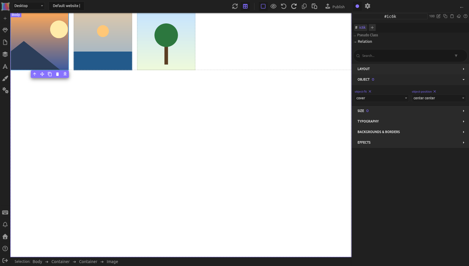
You want three images side by side, each 200px wide, that scale down on mobile.
- Create the gallery container:
- Add a Container, set tag to
section - Set Display to Flex, Flex-wrap to wrap
-
Set Column-gap to 16px
-
Create the first image item:
- Add a Container inside the section, set tag to
article - In the selector area at the top of the right panel, click + and type
gallery-item: the class becomes the target of your styles - Set Flex-basis to 200px, Flex-grow to 0 (Flexbox sector)
-
Set Width to 100%, Height to 200px (square images)
-
Add an image inside the article:
- Drag an Image block into the article and pick or upload a photo
- Give the image the class
gallery-item__imagethe same way - Set Width to 100%, Height to 100%
- Set Object-fit to
coverand Object-position tocenter center(Object sector) -
Add its alt text in the Alt field of the Element settings (gear icon)
-
Make the other two items:
- Select the article, click Copy, then Paste twice: the copies have the same classes, so they share the styles
-
Double-click each copied image to pick another photo, and update its alt text
-
Result: three square images side by side, photos cropped to fill without distortion. On narrow screens, they wrap naturally into rows.
Practical example: responsive hero image with text overlay
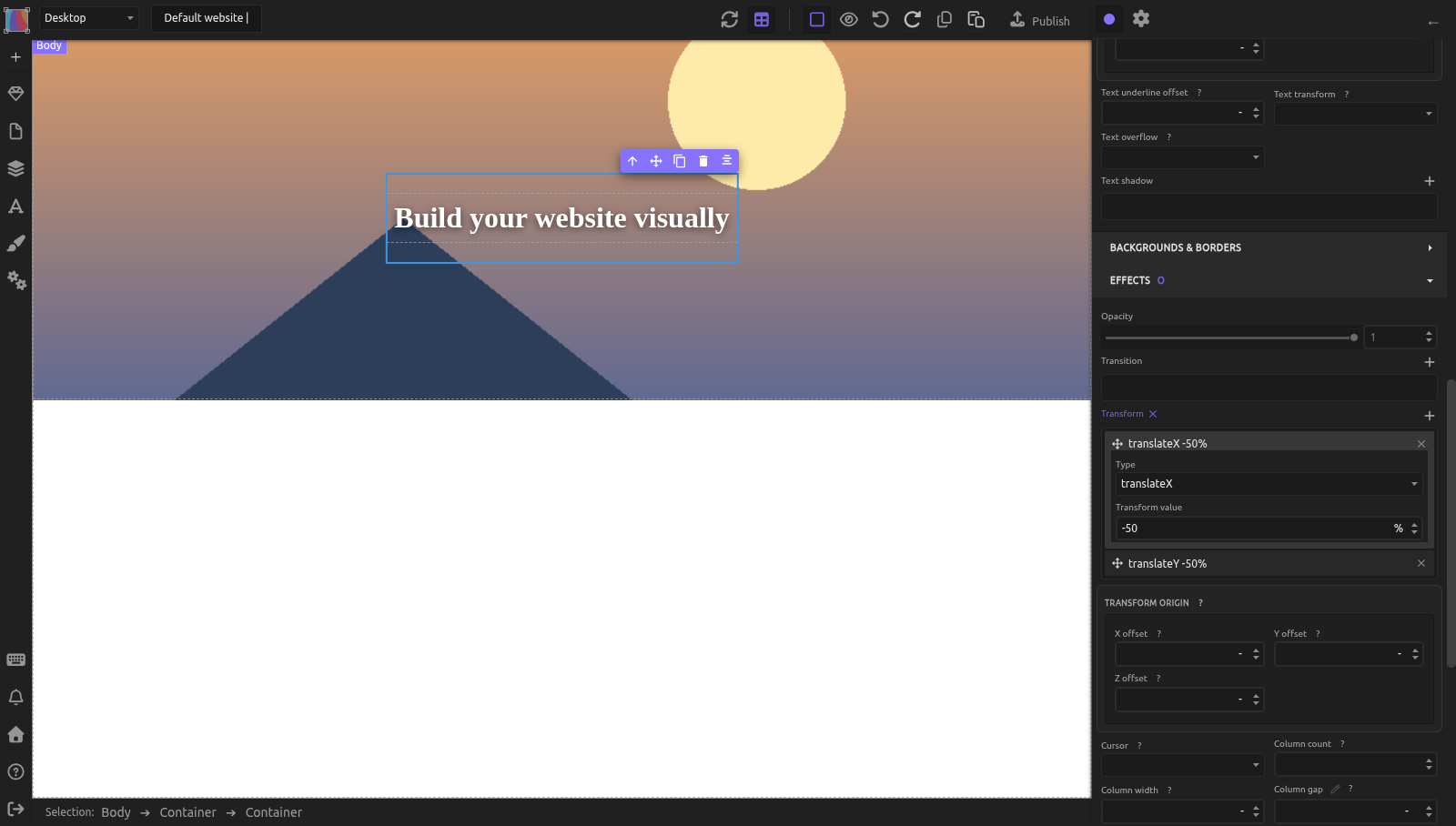
You want a full-width image with text on top.
- Create the hero container:
- Add a Container, set height to 400px (or your choice)
- Set Width to 100%
-
Set Position to relative (so text can position absolutely over it)
-
Add the background image:
- Drag an Image block into the hero Container
- Set Width to 100%, Height to 100%
- Set Object-fit to
cover, Object-position tocenter center -
This fills the hero box without distortion
-
Add text on top:
- Drop a Container on the image (it lands inside the hero), then drop a Text block inside this Container. Do it before the next step: once absolute, an empty Container has no width and you can't drop anything into it.
- Select the Container. Set Position to absolute, Top to 50%, Left to 50%
- To center it on that point, add two Transform layers (Effects sector):
translateX-50%andtranslateY-50% - Style the text with color and a Text shadow to stand out against the image
The image fills the hero area, text floats on top, and everything scales responsively.
Common mistakes
- Forgetting alt text. Every image needs alt text. Screen reader users and search engines depend on it.
- Using
fillobject-fit when you meantcover.filldistorts the image to stretch;covercrops while maintaining aspect ratio. - Not setting width/height on images. If an image has no set size, it displays at its natural resolution, which may be too large or small.
- Setting object-fit without understanding aspect ratio mismatch. Object-fit only matters when the box and image have different proportions.
- Using images as layout tools. For layout spacing and structure, use Containers with semantic tags and Flexbox. Images are for content.
Learn more
- MDN: object-fit — detailed reference
- MDN: object-position — positioning reference
- MDN: img element — image best practices
- MDN: Alt text — accessibility guidelines
- The box model — width and height for media elements
- Accessible images and media — alt text best practices, captions, and reduced motion
- Flexbox layout — arranging media in galleries
Advanced: replaced elements and how Silex handles them
Media elements (img, video, iframe, embed, audio, canvas) are called "replaced elements" in CSS. Unlike normal HTML elements, their appearance is determined by external content (the image file, video stream, etc.) rather than CSS boxes.
In Silex, images cannot be converted to links via the Tag Name selector. The image component removes the href and tag-name traits. If you want a clickable image, wrap it in a Link element instead.
The Object section (with object-fit and object-position properties) appears only when a replaced element is selected. This is done by registering the Object sector to show only for img, video, iframe, embed, audio, and canvas elements.
When you upload images via the Asset Manager, Silex converts URLs to a stored format internally and back to displayable URLs on the canvas — this is transparent to you.
Reference: Object-Fit and Object-Position values
Object-Fit values
| Value | Effect |
|---|---|
fill |
Stretches/squeezes the content to fill the box. Aspect ratio may not be preserved. |
contain |
Scales the content to fit inside the box. Preserves aspect ratio. May letterbox. |
cover |
Scales the content to cover the entire box. Preserves aspect ratio. May crop. |
none |
Content keeps its natural size. May overflow or leave space. |
scale-down |
Uses whichever is smaller: none or contain. |
initial |
Resets to CSS default (fill). |
inherit |
Uses the parent element's value. |
Object-Position values
| Position | Anchors to |
|---|---|
left top |
Top-left corner (0% 0%) |
left center |
Left edge, vertically centered (0% 50%) |
left bottom |
Bottom-left corner (0% 100%) |
center top |
Top edge, horizontally centered (50% 0%) |
center center |
Dead center (50% 50%, default) |
center bottom |
Bottom edge, horizontally centered (50% 100%) |
right top |
Top-right corner (100% 0%) |
right center |
Right edge, vertically centered (100% 50%) |
right bottom |
Bottom-right corner (100% 100%) |
initial |
Resets to CSS default (50% 50%) |
inherit |
Uses parent element's value |
unset |
Removes any set value |
Use these together: cover with center top crops the bottom, keeping the top visible.
Quiz
Q1: A company logo is in a tall sidebar and looks squished. What do you set?
- A) Object-fit to
fill - B) Object-fit to
contain - C) Width to 100%
Answer
B) Object-fit to contain — this scales the logo to fit without distortion. You may see empty space, but the aspect ratio is preserved.
Q2: A hero image has Object-fit: cover, but the subject (at the bottom) gets cropped. How do you fix it?
- A) Set Object-fit to
contain - B) Set Object-position to
center bottom - C) Increase the container height
Answer
B) Set Object-position to center bottom — the crop anchors to the bottom, keeping the subject visible.
Q3: A screen reader user visits your page. An image has no alt text. What happens?
- A) The screen reader reads the file name (IMG_4392.jpg)
- B) The screen reader skips it silently
- C) Either A or B depending on the screen reader
Answer
C) Either A or B depending on the screen reader — some read the file name, some skip it. Either way, add descriptive alt text so all visitors understand the image.
Q4: You want to embed a YouTube video. Which block should you use?
- A) Video block
- B) Map block
- C) Image block
Answer
A) Video block — set its Provider to Youtube (or Youtube (no cookie)) and type the Video ID. The Map block only shows Google Maps.
Q5: Your 600px-wide image takes a long time to load. The original file is 5000px. What should you do?
- A) Use CSS to scale it down
- B) Set Object-fit to
scale-down - C) Resize the image to 1200px before uploading
Answer
C) Resize the image to 1200px before uploading — this cuts the file size dramatically. CSS scaling doesn't reduce the file size, it just displays it smaller.