Elements
All content on your page is built from elements — HTML building blocks that structure, group, and display content.
Elements come from the Blocks panel on the left sidebar. Drag any block onto the canvas to add it. Every block creates an HTML element with a default tag (e.g., <div>, <p>, <img>). After placing an element, you can change its tag with the Tag name dropdown: select the element, then open the Element settings (gear icon at the top of the right panel). The right panel shows the styles by default, so the Tag name only appears once the settings are open.
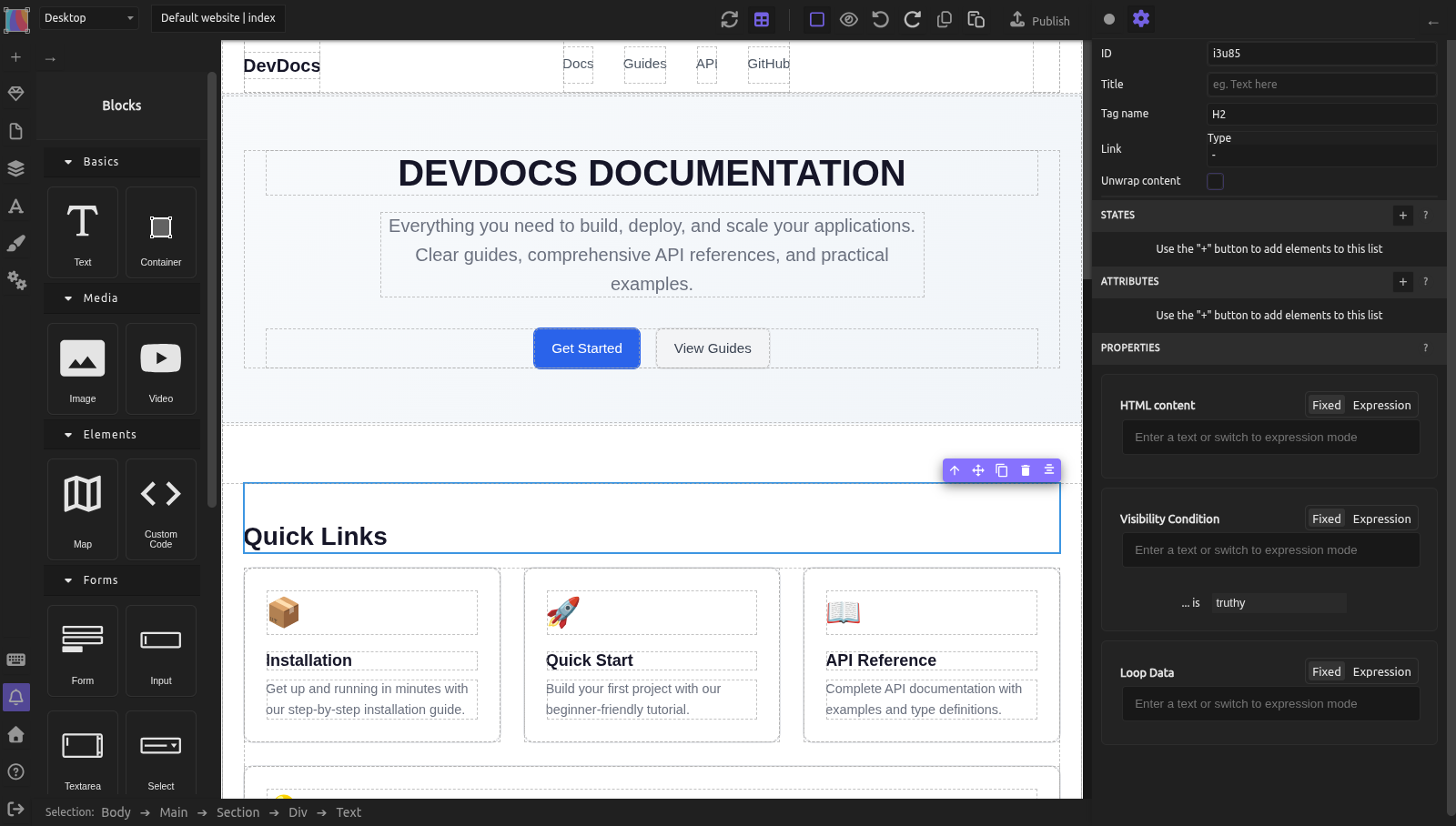
Think of elements as both a visual tool (they appear on your page) and a semantic tool (they tell browsers and screen readers what type of content they contain). Using the right element type makes your site accessible to assistive technologies and improves how search engines understand your content.
Adding elements
To add an element to your page:
- Open the Blocks panel on the left sidebar
- Drag a block onto the canvas
- Drop it where you want it (directly on the canvas or into an existing container to nest it)
- Adjust its size, style, and content as needed
You can later change the element's tag name using the Tag Name dropdown in the Element settings (gear icon). This doesn't delete the element or lose any content — it just changes the HTML tag.
Container elements
Containers are elements that hold other elements. They're the structural backbone of your layouts.
Container (div) — The most flexible container. Drag the "Container" block from Basics. It starts with 100px minimum height so you can see it on the canvas.
Any container can be changed to one of these semantic tags via the Tag Name dropdown:
| Tag | When to use it |
|---|---|
div |
Generic grouping with no semantic meaning. Use when no other tag fits. |
section |
A thematic grouping of content, typically with a heading. Use for sections of your page. |
article |
Self-contained content that could stand alone: a blog post, news story, product card. |
nav |
A group of navigation links (menus, breadcrumbs). |
aside |
Content tangentially related to main content: sidebars, callouts, related links. |
header |
Introductory content or navigational aids for a page or section. Typically contains site logo, tagline, or navigation. |
footer |
Footer content: copyright, contact info, site map, social links. |
main |
The dominant content of the page. Use exactly once per page. |
address |
Contact information for the author or organization (address, phone, email). |
blockquote |
A block of text quoted from another source. Should include a citation. |
pre |
Preformatted text with whitespace and line breaks preserved. Use for code blocks or poetry. |
details |
A disclosure widget (collapsible box) that visitors can open and close. |
summary |
The visible heading for a details element. Always place it as the first child of details. |
See Semantic HTML for detailed guidance on semantic containers and when to use each one.
Text elements
Text elements hold readable content. The Text block creates a div: change its tag to p for a paragraph, or to a heading.
| Tag | Purpose |
|---|---|
p |
A paragraph of body text. |
h1 |
The main page heading. Use exactly once per page. |
h2 |
A major section heading. Use for top-level sections. |
h3 |
A subsection heading under an h2. |
h4 |
A subsection under an h3. |
h5 |
A minor heading. |
h6 |
The smallest heading level. |
span |
Inline text wrapper. Use to style a word or phrase within a paragraph without creating a line break. |
label |
A caption for a form input. Link it to the input using the For field of the Element settings. |
button |
A clickable button. Useful for form submission or triggering interactions. |
To add text: drag the Text block from the Blocks panel. It includes 10px padding by default. To change it to a heading, select it, then use the Tag Name dropdown in the Element settings (gear icon) and choose from the "Headings" group.
See Semantic HTML for best practices on heading hierarchy.
Connecting labels to inputs
When you change a text element's tag to label, a For field appears in the Element settings (gear icon). Enter the ID of the form input this label describes. This connection is essential for accessibility — screen readers announce "this label belongs to this input," helping visitors understand what each field is for.
Link elements
There is no Link block: an element becomes a link through the Link field of its Element settings (gear icon). Select a Text, or a Container to make a group of elements clickable, then choose its Type and the destination:
- URL — external site (e.g.,
https://example.com) - Email — email link (generates
mailto:URL) - Page — internal link to another page in your site (generates a relative
./page-name.htmlURL)
The element becomes an a (anchor) element.
Always use the Page type for internal links, not a URL typed by hand. This way, if you rename a page, all links update automatically.
See Pages for detailed internal linking rules.
Media elements
Media elements display images, videos, audio, and embedded content.
| Tag | Purpose |
|---|---|
img |
Displays an image file (PNG, JPG, SVG, WebP). Always include alt text. |
video |
Embeds a video player. Can autoplay, mute, loop. |
audio |
Embeds an audio player. Good for podcasts or music. |
iframe |
Embeds an external page or widget: maps, videos, social media feeds. |
embed |
Embeds external content. Less common than iframe. |
canvas |
A drawing surface for scripts. Advanced usage only. |
Drag the Image, Video, or Map blocks from the Blocks panel. See Images and media for detailed guidance on alt text, object-fit, and media configuration.
List elements
Lists group related items. Use them for navigation menus, feature lists, step-by-step instructions, or any logically grouped content.
| Tag | Purpose |
|---|---|
ul |
Unordered list (bulleted). Use when order doesn't matter. |
ol |
Ordered list (numbered). Use when order is significant (steps, rankings). |
li |
A list item inside ul or ol. |
To create a list:
- Add a Container block
- Change its tag to
ul(orolfor ordered) - Add child containers inside it
- Change each child to
li - Add text or other content inside each
li
Form elements
Forms collect input from visitors. A form is a form element with input elements inside it.
| Tag | Purpose |
|---|---|
form |
A container for form controls and submission. Sets action/method for processing. |
input |
Single-line text field, checkbox, radio, email, number, date, and more. |
textarea |
Multi-line text field. Good for longer messages or comments. |
select |
A dropdown menu. Contains option elements as choices. |
option |
A single choice inside a select dropdown. |
button |
Submits the form or triggers JavaScript. Place inside the form. |
To create a form:
- Drag the Form block from the Forms category of the Blocks panel (
formis not in the Tag name list). It comes with sample fields (Name, Email, Gender, Message) and a Send button: keep the ones you need, delete the others. - Add more fields with the Label, Input, Textarea, Select, Checkbox and Radio blocks
- Give each input an ID in the Element settings (gear icon), and set the For field of its label to that ID
- Select the button and set its Type to
submit: the button of the Form block is of typebutton, which does not send the form
See Publishing: forms for form submission and validation.
Changing an element's tag name
Select any element on the canvas. The right panel opens on the styles: open the Element settings (gear icon) to find the Tag name dropdown. Tags are grouped by category:
- Containers:
div,span,p - Headings:
h1,h2,h3,h4,h5,h6 - Main document structure:
main,section,article,nav,aside,header,footer - Content grouping:
address,blockquote,pre,time - Lists:
ul,ol,li - Interactive/form:
button,label,details,summary
If you have an element with a tag not in these groups (like form or input), it appears in an "Other" group.
Changing the tag does NOT lose content or styles. The element keeps its text, children, styles, and position. Only the HTML tag changes. This affects semantics (how browsers and screen readers interpret the element) but not the visual appearance.
Custom code and shortcodes
The Custom code block lets you paste raw HTML, CSS, or JavaScript. Use it for:
- Third-party embed codes (maps, calendars, social widgets)
- Analytics scripts
- Custom styling or functionality Silex doesn't offer as a built-in block
The Shortcode block is for build awesome (powered by Eleventy) integration. It inserts build awesome shortcodes that process at build time. Use this only if your site uses the build awesome publication pipeline.
Practical example: building a feature list
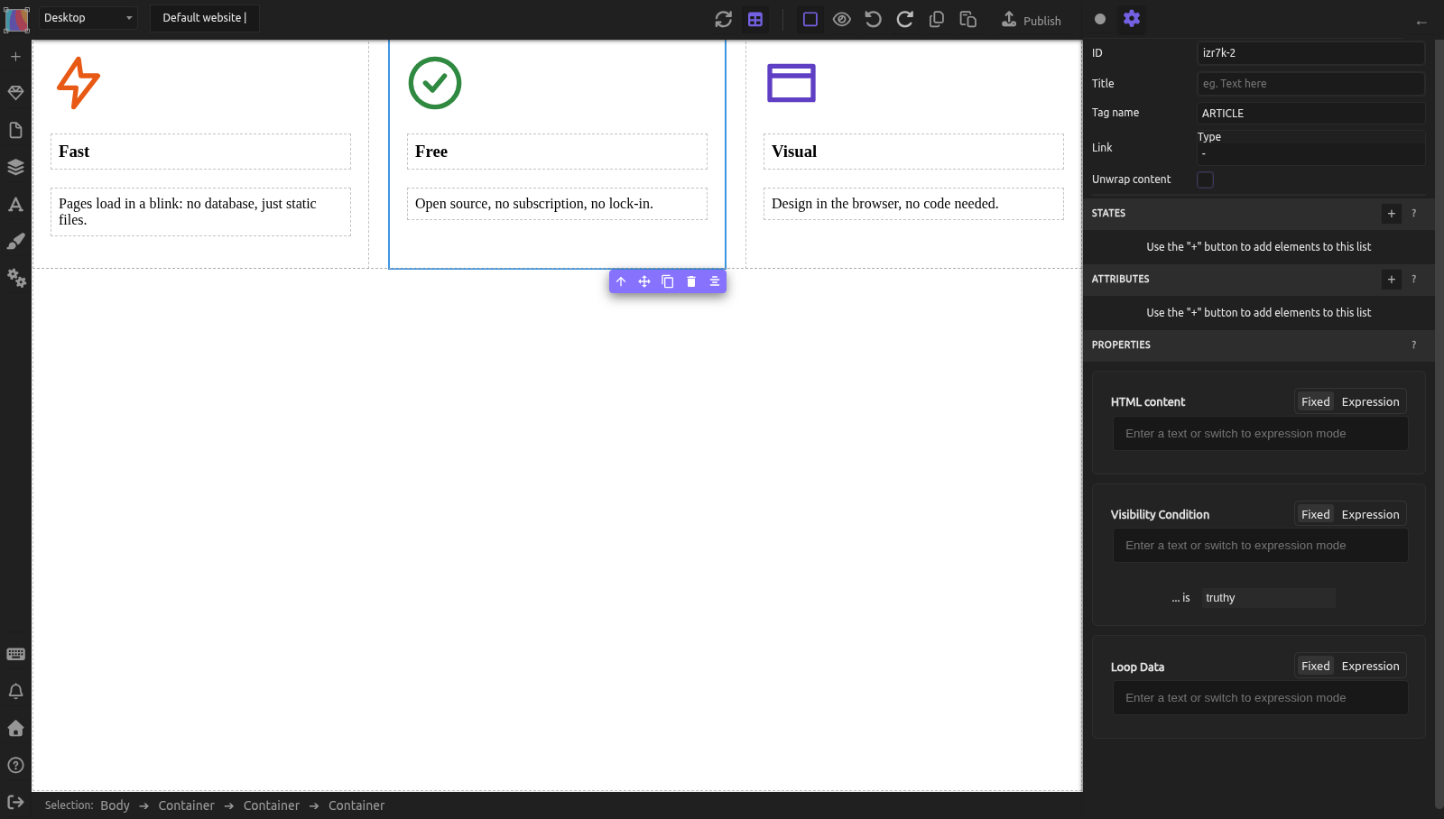
You want three features displayed side by side, each with an icon and description.
- Create the layout:
- Add a Container, set tag to
section - Inside it, add another Container for the features row
-
Select the row and, in the styles, set Display to
flex(Layout sector), then Flex-direction torowand Flex-wrap towrap(Flexbox sector, which appears once Display isflex) -
Create one feature card:
- Add a Container inside the row, set tag to
article - In the selector area at the top of the right panel, click + and type
feature-card: the class is added and becomes the target of your styles - Right away, set the Flex-basis of
.feature-cardto200pxand Flex-grow to1(Flexbox sector). Until then the empty article has no width in the flex row, so you can't drop anything into it. If you can't click it on the canvas, select it in the Layers panel. - Add an Image block inside the article for the icon (the image manager opens: upload or pick your icon)
- Add a Text block below it, change tag to
h3 -
Add another Text block for the description and change its tag to
p(a Text block starts as adiv) -
Space the card:
- Add padding on
.feature-card(Size sector) -
On the row, set Column gap and Row gap (Effects sector: there is no single
gapfield) -
Duplicate the card:
- Select the article, click Copy then Paste twice in the top bar (or Ctrl+C, Ctrl+V), or use the duplicate icon (two squares) of the small toolbar above the selected element, or Ctrl+D. The copies have the
feature-cardclass, so they share its styles. -
Update the icon (double-click the image), heading, and description in each
-
Verify semantics:
- Section groups the features thematically
- Each article is a self-contained feature
- h3 provides a clear heading for each feature
Common mistakes
- Using
divwhen a semantic tag fits better.section,article,nav,header, andfooterhelp screen readers and SEO. Use them. - Forgetting alt text on images. Every image needs descriptive alt text. If you forget, screen reader users miss the image entirely.
- Nesting
h1inside anh2. Heading hierarchy matters: h1 → h2 → h3. Don't skip levels. - Creating lists without
ul/olandlitags. Styled text that looks like a list confuses screen readers. Use proper list tags. - Not labeling form inputs. Inputs without labels are confusing. Always add a
labelwith its "For" field linked to the input ID.
Learn more
- Semantic HTML — semantic HTML and heading best practices
- Images and media — image alt text, object-fit, media configuration
- The box model — spacing elements with margin and padding
- Flexbox layout — arranging elements side by side
- Accessibility enhancements — on the roadmap for more built-in accessibility features
Advanced: elements and GrapesJS components
Every element on the canvas is a GrapesJS Component. The Blocks panel defines available component types. Silex registers a "Container" block (category Basics) that creates a component with container type and default CSS class silex-default-container for minimum-height styling. The "Text", "Image", "Video", and "Map" blocks come from grapesjs-blocks-basic; Silex overrides inline styles with CSS classes.
The Tag Name dropdown is a custom trait added by the semantic plugin to every component type. This lets any element change its tag. Image components have special handling: the href and tag-name traits are removed because images must keep the img tag. A custom src trait manages the image URL instead.
Reference: all tags in the Tag Name selector
| Group | Tags |
|---|---|
| Containers | DIV, SPAN, P |
| Headings | H1, H2, H3, H4, H5, H6 |
| Main document structure | MAIN, SECTION, ARTICLE, NAV, ASIDE, HEADER, FOOTER |
| Content grouping | ADDRESS, BLOCKQUOTE, PRE, TIME |
| Lists | UL, OL, LI |
| Interactive/form | BUTTON, LABEL, DETAILS, SUMMARY |
If an element uses a tag not in these groups (e.g., FORM, INPUT, TEXTAREA, SELECT), it appears under an "Other" group.
Quiz
Q1: You want a sidebar with related links next to your main content. Which tag should the sidebar container be?
- A)
div - B)
section - C)
aside
Answer
C) aside — it marks content tangentially related to main content. Use the Tag Name dropdown to change a container from div to aside.
Q2: You dragged a Text block onto the canvas and want it to be a section heading. How do you change it?
- A) Double-click it and type your heading
- B) Select it and change the Tag Name from
divtoh2in the Element settings (gear icon) - C) Delete it and drag a different block
Answer
B) Select it and change the Tag Name from div to h2 in the Element settings (gear icon) — the Tag Name dropdown is there, under the Headings group.
Q3: You have a form with an email input, but screen readers don't announce a label. What's missing?
- A) The input needs a
placeholderattribute - B) A
labelelement with its "For" field linked to the input's ID - C) The input needs type
email
Answer
B) A label element with its "For" field linked to the input's ID — screen readers use this connection to announce "this label belongs to this input."
Q4: You want to embed a Google Map. Which block do you use?
- A) The Map block from Blocks panel
- B) The Custom code block with embed code
- C) Both work
Answer
C) Both work — the Map block creates an iframe element, or use Custom code to paste Google Maps embed code directly.
Q5: You changed an element from div to nav. Did you lose any content or styles?
- A) Yes, changing the tag deletes the element
- B) No, changing the tag keeps content, styles, and position — only the HTML tag changes
- C) Only if you didn't save first
Answer
B) No, changing the tag keeps content, styles, and position — only the HTML tag changes — this affects semantics for screen readers and SEO, but not appearance.