Accessible forms
Forms are where accessibility matters most. A contact form, a search box, a newsletter signup -- if a user cannot understand what a field expects, cannot identify errors, or cannot submit the form with a keyboard, the form is broken for them.
Two guiding principles:
- Every input needs a visible label. Placeholders are not labels. Screen readers may not announce placeholders, and they disappear as soon as the user starts typing.
- Errors must be clear and specific. "There was an error" is useless. "Email address must include an @ symbol" is actionable.
Labeling form fields
Every <input>, <textarea>, and <select> needs an associated <label>. The label tells screen readers what the field is for. Without it, a screen reader may announce "edit text, blank" -- the user has no idea what to type.
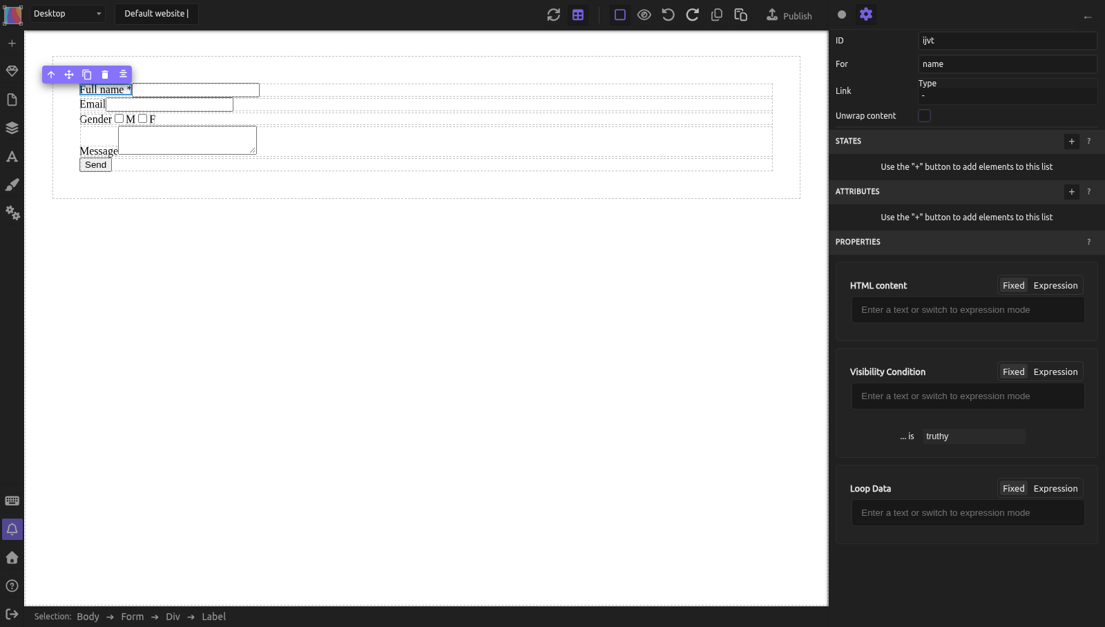
How to create a label in Silex
- Drag a Label block from the Blocks panel (or drag a Text block and change its Tag Name to
LABELin the Element settings, gear icon at the top of the right panel) - Type the label text (e.g., "Email address")
- Select the label element
- In the Element settings (gear icon), a For field appears when the tag is
LABEL - Enter the input's
idin the For field
To set an id on the input:
- Select the input element
- In the Element settings (gear icon), fill the ID field with something descriptive (e.g.,
email)
Now the label and input are programmatically linked. Clicking the label focuses the input, and screen readers announce the label text when the input receives focus. The published HTML reads <label for="email"> and <input id="email">.
Placeholder is not a label
Placeholder text disappears when the user types. This means:
- Users cannot check what the field expects after they start typing
- Placeholder text often has insufficient contrast (light gray)
- Some screen readers do not announce placeholder text
- Users with cognitive disabilities may think the field is already filled in
Use placeholders for examples ("e.g., name@example.com"), not for the field name. Always have a visible <label>.
Grouping related fields
When fields are related -- like first name and last name, or a set of radio buttons -- group them so the relationship is clear.
In standard HTML, <fieldset> and <legend> create labeled groups. Silex does not have a dedicated fieldset block, but you can achieve the same effect:
- Wrap related fields in a container
- Change the container's Tag Name to
SECTION - Add a heading (
h2,h3, etc.) as the first child to describe the group - Screen readers will announce the section and its heading, providing context
For radio buttons and checkboxes that form a group (e.g., "Preferred contact method: Email / Phone / SMS"), this grouping is essential -- without it, the user hears each option in isolation.
Required fields
To mark a field as required:
- Select the field (Input, Textarea, Select, Checkbox or Radio)
- In the Element settings (gear icon), check Required
- Add a visual indicator next to the label: an asterisk (*) with an explanation at the top of the form ("Fields marked * are required")
Do not rely on color alone (e.g., red border) to indicate required fields. See Text, contrast, and readability for why.
Autocomplete
The autocomplete attribute helps browsers and password managers fill in common fields automatically. This is especially important for users with motor impairments or cognitive disabilities -- fewer keystrokes means fewer errors.
Add autocomplete via the Attributes section:
| Field | Autocomplete value |
|---|---|
| Full name | name |
email |
|
| Phone | tel |
| Street address | street-address |
| City | address-level2 |
| Postal code | postal-code |
| Country | country |
| Credit card number | cc-number |
| Username | username |
| Current password | current-password |
| New password | new-password |
To add:
- Select the input
- In the Attributes section, click +
- Name the attribute
autocomplete - Set the value (e.g.,
email)
Error messages
When form validation fails, error messages must be:
- Visible -- not just a color change, not hidden in a tooltip
- Specific -- "Email address must include an @ symbol" not "Invalid input"
- Associated with the field -- placed near the field, ideally right below it
For client-side validation, modern browsers handle basic validation automatically when you use the correct input types (email, number) and check Required. The browser displays native error messages that are already accessible.
For custom validation using JavaScript (via Custom code), associate error messages with inputs using aria-describedby:
- Add a text element below the input for the error message
- Give the error element an
id(via the Attributes section): e.g.,email-error - On the input, add an
aria-describedbyattribute (via the Attributes section) with the error element's id:email-error - Screen readers will announce the error text when the input is focused
Input types
Using the correct input type improves accessibility and usability:
| Type | Effect |
|---|---|
text |
Any text (default) |
email |
Shows email keyboard on mobile, validates @ |
number |
Shows numeric keyboard, allows increment buttons |
password |
Masks input, triggers password manager |
Set the input type in the Type menu of the Element settings (gear icon) when the input element is selected. The menu offers only these four types.
Practical example: accessible contact form
You are building a contact form with name, email, message, and submit button.
-
Form container: Drag a Form block. The
<form>element is already correct. It comes with sample fields (Name, Email, Gender checkboxes, Message and a Send button): reuse them and delete the Gender row. -
Name field:
- Label: double-click it and type "Full name *". In the Element settings, set For:
name -
Input: set ID to
nameand check Required in the Element settings. In Attributes, click +, name itautocompleteand give it the valuename -
Email field:
- Label: "Email address *", For:
email -
Input: its Type is already
email. Set ID toemail, check Required, and add the attributeautocomplete=email -
Message field:
- Label: "Your message *", For:
message -
Textarea: set ID to
messageand check Required -
Submit button:
- Select the button. In the Element settings, set Text to "Send message" and Type to
submit: the Form block's button is of typebutton, which neither submits the form nor triggers the validation -
The
<button>element is already keyboard-accessible -
Required fields notice:
-
Add a Text element above the first field: "Fields marked * are required"
-
Test (on the published page: in the editor, even in preview, Tab doesn't move the focus between the fields):
- Tab through the form: each field should receive focus in order
- Screen reader should announce: "Full name, required, edit text" for the first field
- Submit with empty fields: browser should show validation messages
Common mistakes
- No labels on inputs. The most common form accessibility failure. Every input needs a
<label>with a matchingforattribute. - Placeholder as the only label. Placeholder text disappears on input, has poor contrast, and may not be announced by screen readers.
- Required fields indicated only by color. Add text ("required" or "*" with explanation) alongside any color indicator.
- Generic error messages. "Error" or "Invalid input" does not help the user fix the problem. Be specific.
- No autocomplete. Users with motor impairments benefit greatly from autocomplete. Add the attribute to standard fields.
- Wrong input types. Using
type="text"for email means no email keyboard on mobile and no browser validation. Use the right type.
Learn more
- MDN: Web form accessibility -- structuring forms accessibly
- MDN: The label element -- label reference
- MDN: autocomplete attribute -- all autocomplete values
- WebAIM: Creating Accessible Forms -- comprehensive guide
- Forms -- form basics in Silex
- Semantic HTML -- the LABEL tag and For attribute
Reference: WCAG form requirements summary
| Criterion | Level | Requirement |
|---|---|---|
| 1.3.1 Info and Relationships | A | Labels, instructions, and groupings are programmatically associated |
| 1.3.5 Identify Input Purpose | AA | Input purpose is programmatically determinable (autocomplete) |
| 2.4.6 Headings and Labels | AA | Labels describe topic or purpose |
| 3.3.1 Error Identification | A | Errors are identified and described in text |
| 3.3.2 Labels or Instructions | A | Labels or instructions provided for user input |
| 3.3.3 Error Suggestion | AA | Suggestions for fixing errors are provided |
Quiz
Q1: A form field has placeholder text "Enter your email" but no <label> element. A screen reader user focuses the field. What do they hear?
- A) "Enter your email, edit text"
- B) "Edit text, blank" (the placeholder may not be announced)
- C) "Email, required, edit text"
Answer
B) "Edit text, blank" -- Some screen readers do not announce placeholder text. Without a <label>, the user has no way to know what the field expects. Always use a visible label.
Q2: You want to mark a field as required. Which approach is most accessible?
- A) Red border only
- B) Red border + asterisk (*) in the label + "Fields marked * are required" at the top +
requiredattribute - C) Placeholder text that says "Required"
Answer
B) Red border + asterisk + explanation + required attribute -- This covers all users: visual (red border + asterisk), text-based (explanation), and programmatic (the required attribute tells browsers and screen readers).
Q3: A contact form has fields for name, email, and phone, but no autocomplete attributes. Who is most affected?
- A) Sighted users with a mouse
- B) Users with motor impairments who struggle with typing
- C) Screen reader users
Answer
B) Users with motor impairments -- autocomplete reduces the number of keystrokes needed. For users who find typing physically difficult, this is a significant usability improvement.