Selectors and Classes
Selectors are how CSS targets elements to style. A class selector targets elements with a specific class name; pseudo-classes target elements in specific states (like :hover); combinators target elements based on their position in the tree. Master selectors and you control what gets styled and when.
Silex uses BEM class naming and the Advanced Selectors plugin to let you write CSS selectors visually. Instead of hand-coding .card:hover { ... }, you pick the class, the state, and the effect — the editor generates the selector for you.
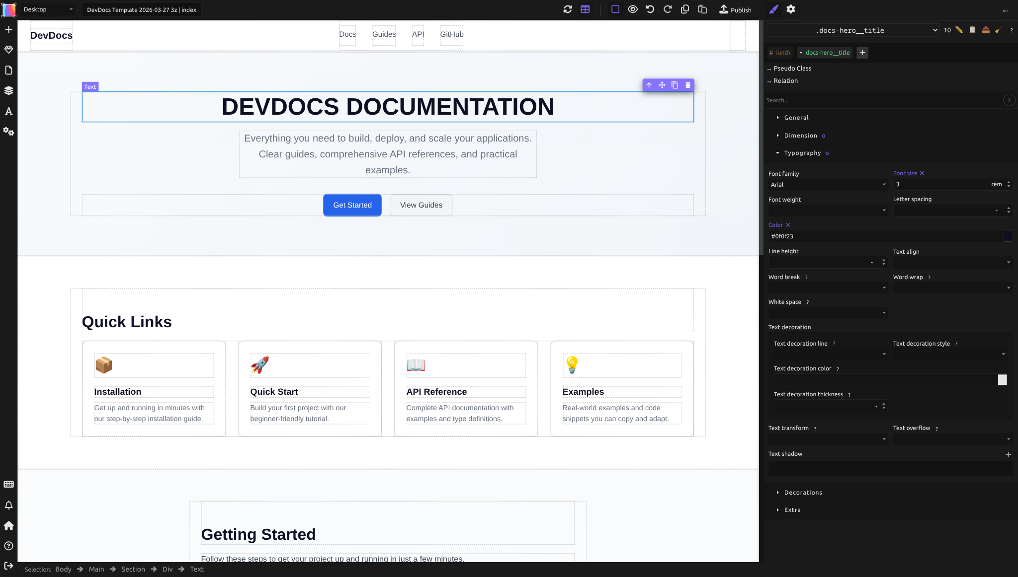
Note: Silex currently supports selectors up to compound and combinator complexity. For advanced selector composition beyond BEM and basic pseudo-classes, the Tailwind CSS Support roadmap feature may eventually provide utility-class shortcuts.
Understanding CSS selectors
A CSS selector is a pattern that matches elements in the HTML. The simplest is an element selector (e.g., p styles all paragraphs). But the most flexible is a class selector (e.g., .button styles all elements with class="button").
Silex encourages class selectors because they're reusable and don't depend on HTML structure. An element selector like div would style every div, which is too broad and fragile.
Naming classes with BEM
BEM (Block, Element, Modifier) is a naming convention that makes class names semantic and reusable. It's simple:
- Block: a standalone piece of the interface (e.g.,
.card,.button,.navbar) - Element: a part of a block (e.g.,
.card__title,.button__icon) - Modifier: a variant of a block or element (e.g.,
.button--primary,.card--featured)
Example:
.card { /* the block */ }
.card__title { /* title inside a card */ }
.card__description { /* description inside a card */ }
.card--featured { /* a special variant */ }
.card--featured .card__title { /* title inside a featured card */ }
This structure makes classes self-documenting. Anyone reading .button--large knows it's a large variant of a button. It also prevents naming collisions — you won't accidentally have two unrelated elements with the same .title class.
Apply BEM when naming classes in Silex:
1. Select an element
2. In the selector area at the top of the right panel, click + Add a new selector
3. Name it following BEM: .block, .block__element, or .block--modifier
Styling elements in different states
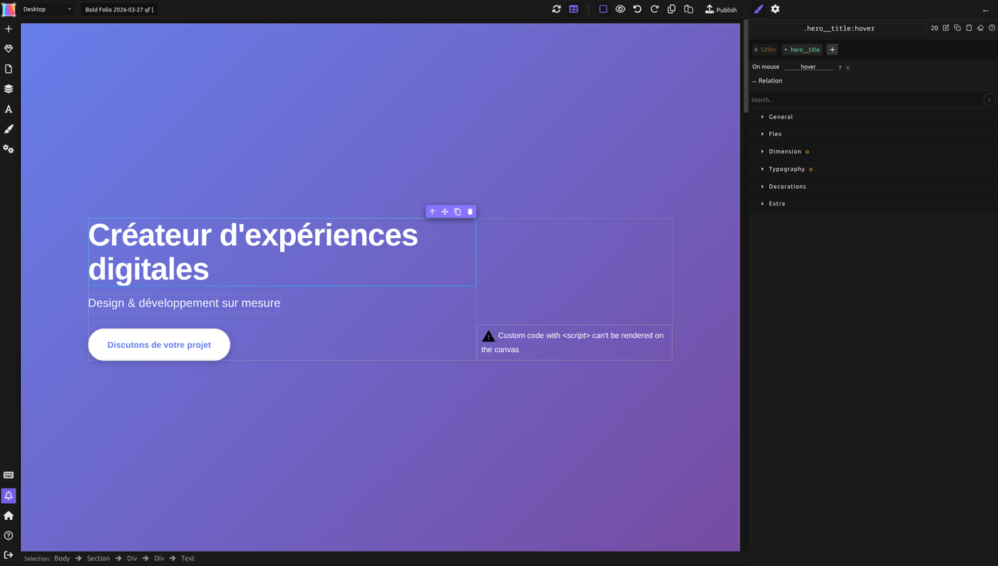
Elements have states — when the user hovers, focuses, clicks, or visits them. Pseudo-classes let you style based on state.
The Advanced Selectors plugin in Silex exposes many pseudo-classes visually. Instead of typing :hover, you pick it from a dropdown.
Common pseudo-classes:
- :hover — when the user hovers over the element
- :active — when the user clicks it
- :focus — when the element has keyboard focus
- :visited — for links the user has visited
- :first-child — the first child of its parent
- :last-child — the last child of its parent
Example: Style a button's background on hover:
- Select the button element
- In the selector area, click + (Add a new selector) and type
button, without the dot: the element gets the class.button - Click Pseudo Class and choose
hover: the selector becomes.button:hover - Set the background color for that state
Typing .button:hover directly in the + field is refused as an invalid selector.
The button now changes color when you hover over it, and stays normal otherwise.
The selector toolbar
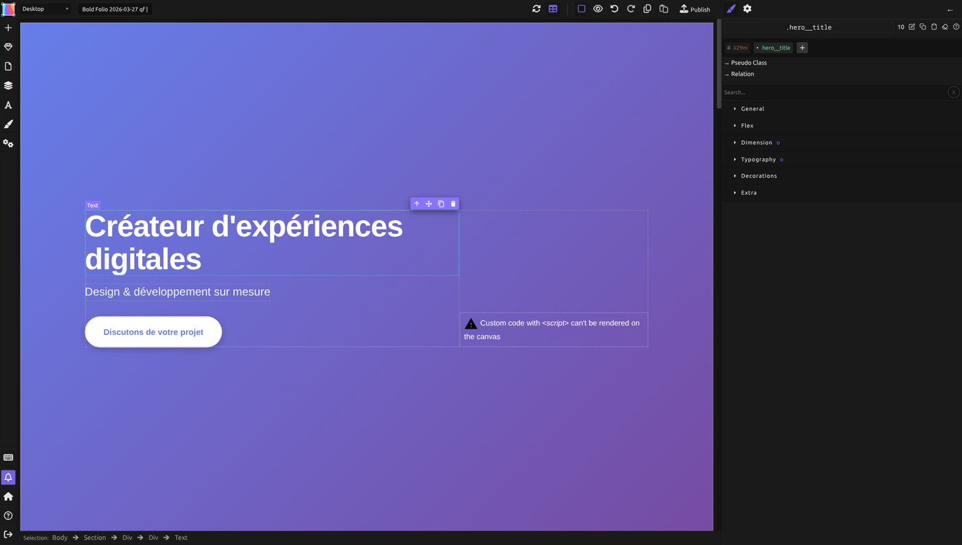
The selector bar sits at the top right of the Style panel. It shows the current selector (class name or compound selector), a specificity number that updates dynamically as you build the selector, and a row of action buttons:
| Button | Icon | Action |
|---|---|---|
| Edit selector | Pencil | Rename or modify the current selector |
| Copy style | Clipboard | Copy the current element's styles to a clipboard (for pasting onto another element) |
| Paste style | Paste | Apply previously copied styles to the selected element |
| Clear style for this selector | Broom | Remove all styles from the current selector |
| Help | Question mark | Open documentation about selectors |
Classes are displayed with a bullet prefix (e.g., * my-class), while IDs are shown with a hash prefix (# my-id).
Below the selector name, you see three buttons for extending the selector:
- "+ Add a new selector" -- adds another class or ID to the current selector.
- "Pseudo Class" -- opens a dropdown with all available pseudo-classes and pseudo-elements. Each entry in the dropdown includes a link to its MDN documentation page and a remove button to clear it.
- "Relation" -- adds a line "When it is inside of" with a menu of eight relations: inside of, direct child of ( > ), adjacent to ( + ), after ( ~ ), contains ( :has ), does not match ( :not ), matches ( :is ) and matches ( :where ). In the field below it, click + and type the class of the other element. With the four combinators below, that other element comes first in the selector: the selected element is always the one you style.
Copy/paste style workflow: To apply styles from one element to another, select the source element, click Copy style in the selector toolbar, then select the target element and click Paste style. This copies all style declarations from the source selector to the target.
Targeting elements by position
Pseudo-classes can also select based on position:
:nth-child(n)— every nth child (e.g.,:nth-child(2)is the second child,:nth-child(2n)is every even child):nth-of-type(n)— every nth element of that tag type:only-child— an element with no siblings
Use case: Style every other row in a table with a light background for readability. Use :nth-child(2n) to select every second row.
Using combinators to target related elements
Combinators let you select elements based on their relationship to other elements. In the Relation menu, the four combinators below are written as sentences:
| Combinator | Syntax | Meaning | MDN |
|---|---|---|---|
| Descendant (inside of) | .parent .child |
Any .child inside .parent (at any depth) |
link |
| Child (direct child of) | .parent > .child |
Only direct .child of .parent (one level down) |
link |
| Adjacent sibling (adjacent to) | .item + .item |
An .item immediately following another .item |
link |
| General sibling (after) | .item ~ .item |
Any .item that follows another .item (at any distance) |
link |
Examples:
Descendant combinator: .card .title — style all titles inside cards (at any depth).
Child combinator: .navbar > .item — style items that are direct children of the navbar (not nested deeper).
Adjacent sibling: .input + .error — style an error message that immediately follows an input field.
General sibling: .item ~ .item — style items that follow another item of the same class (useful for adding spacing between siblings).
Creating complex selectors visually
The Advanced Selectors plugin lets you build complex selectors without code:
- Select the element to style (e.g., an icon inside a button), then look at the selector area at the top of the right panel
- Click + and type
icon - Click Relation and choose direct child of ( > )
- In the field below, click + and type the class of the other element (
button), then click the Pseudo Class under it and choosehover
The UI generates the full selector for you: .button:hover > .icon.
Step-by-step example: styling a link after an icon
- Select the link element
- In the selector area, click + and type
nav-link - Click Relation and choose adjacent to ( + )
- In the field below, click + and type
nav-icon - Set the style (e.g., margin, color)
Result: the selector becomes .nav-icon + .nav-link, which targets the nav link that immediately follows a nav icon.
Practical example: styling a card hover effect
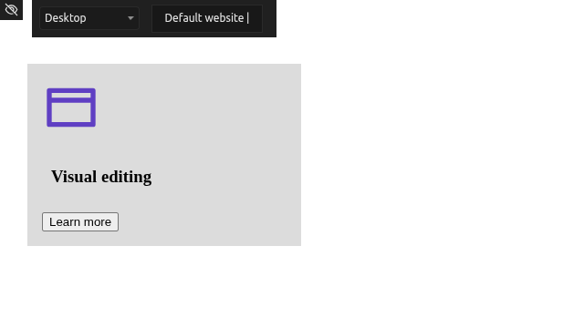
Scenario: You have cards with an image, title, and button. On hover, the background darkens and the button appears.
- Create a card block with BEM classes. Build a Container with an Image, a Text and a Button inside, then select each element, click + (Add a new selector) in the selector area and type its class:
.card(the block).card__image(image inside).card__button(button inside)
Once an element has a class, the Style panel styles the class (its ID is grayed out).
- Style the button to be hidden by default:
- Select
.card__button -
Set Opacity to
0or Display tonone -
Add a hover state for the card:
- Select the card
- Click Pseudo Class and choose
hover: the selector becomes.card:hover -
Set Background-color to a darker shade
-
Add a hover state for the button:
- Select the button
- Click Relation: a "When it is inside of" line appears. In the selector field below it, click + and type
card, then click the Pseudo Class under it and choosehover - The selector becomes
.card:hover .card__button - Set Opacity to
1or Display toflex(making it visible on hover)
Result: when you hover over the card, the background changes and the button fades in — all via CSS selectors, no JavaScript needed. Check it in Preview (eye icon in the top bar).
The pseudo-class stays on the card's selector: the next time you select the card, the Style panel still edits .card:hover. Remove hover (×) before styling the card itself again.
Avoiding common selector pitfalls
Use classes, not IDs: Don't style by element ID (#my-button). IDs are unique and can't be reused. Classes are reusable and are the right tool for CSS.
Avoid descendant selectors for everything: .card .title .text selects deeply nested elements. This is fragile — if you move .text to a different parent, the selector breaks. Use combinators thoughtfully and keep selectors as short as possible.
Don't over-qualify selectors: .card.card--featured is redundant; just use .card--featured. Over-qualification increases specificity and makes the selector harder to override later.
Custom HTML attributes need the data- prefix: Silex accepts attribute selectors for standard HTML attributes, with or without a value ([title="intro"]), and for data-* attributes without a value ([data-state]). [data-state="active"] is refused as an invalid selector, and so are custom attributes without the data- prefix: use [data-myattr] instead of [myattr].
Remember specificity: A selector's specificity determines which rule wins when styles conflict. Class selectors (.button) and attribute selectors ([data-state]) have the same specificity, and an ID (#my-button) is higher. Generally, keep specificity low and consistent.
Common mistakes
- Naming classes without a convention. Avoid random names like
.blue-box-thing. Use BEM or another convention so classes are predictable. - Applying pseudo-classes to the wrong element.
:hoveron a child doesn't trigger on parent hover. Use combinators to style related elements. - Forgetting that CSS is cascading. Later rules override earlier ones if specificity is equal. Put more specific selectors later in your stylesheet.
- Using element selectors for styling.
p { color: red; }styles all paragraphs. This is too broad. Use classes instead. - Mixing BEM classes inconsistently. If you use BEM for some elements and random names for others, your codebase becomes hard to maintain.
Learn more
Full walkthrough — narrated, in English:
- MDN: CSS Selectors — full reference
- MDN: Pseudo-classes — all available pseudo-classes
- MDN: Combinators — detailed combinator reference
- BEM Methodology — official BEM documentation
- MDN: Specificity — how CSS decides which rule wins
- Tailwind CSS Support — vote for utility-class alternatives
- Colors and backgrounds — where selectors are most often used
- Positioning — using pseudo-elements like
::beforeand::after - Keyboard navigation and focus — styling :focus and :focus-visible for accessibility
Advanced: pseudo-elements and nested selectors
Pseudo-elements: ::before and ::after
Pseudo-elements create content that isn't in the HTML. The two most common are:
::before` — inserts content before the element's content::after` — inserts content after the element's content
You must set the content property to a string or none. Common uses:
- Decorative icons or shapes before/after text
- Quotation marks around quotes
- Underlines or highlights on headings
Example: Add a decorative line before a heading:
In Silex, pseudo-elements appear as selectors (like pseudo-classes) and the Content property appears only when you select a pseudo-element.
Relational pseudo-classes: :has, :is, :not, :where
Modern CSS includes relational pseudo-classes that make complex selectors easier:
:has()— matches an element that has a descendant matching the selector:is()— matches an element that matches any of the selectors:not()— matches an element that doesn't match the selector:where()— like:is()but with zero specificity
The Advanced Selectors plugin supports these. Use them to write cleaner, more powerful selectors without deep nesting.
Example: Style all list items except the last one:
Nested selectors (future feature)
CSS Nesting (a newer feature) allows you to write selectors in a nested structure, similar to SCSS. Silex may support this in future versions, but for now, write individual selectors for each state or relationship.
Reference: all pseudo-classes supported in Silex
| Pseudo-class | Meaning | Browser Support |
|---|---|---|
:hover |
User hovers over the element | All |
:active |
User actively clicks/presses the element | All |
:focus |
Element has keyboard focus | All |
:focus-within |
Element or one of its descendants has focus | All |
:focus-visible |
Has keyboard focus and focus indicator is visible | Modern browsers |
:visited |
Link has been visited | All (limited styling for security) |
:link |
Link has not been visited | All |
:any-link |
Any link (visited or not) | Modern browsers |
:first-child |
First child of parent | All |
:last-child |
Last child of parent | All |
:nth-child(n) |
nth child of parent | All |
:nth-last-child(n) |
nth child from the end | All |
:only-child |
Only child of parent | All |
:first-of-type |
First element of its type among siblings | All |
:last-of-type |
Last element of its type among siblings | All |
:nth-of-type(n) |
nth element of that type | All |
:nth-last-of-type(n) |
nth element of that type from the end | All |
:only-of-type |
Only element of its type among siblings | All |
:empty |
Has no children | All |
:root |
The document root element | All |
:scope |
The scope element (usually the root) | Modern browsers |
:target |
Element targeted by a URL fragment (#) | All |
:enabled |
Form element is enabled | All |
:disabled |
Form element is disabled | All |
:checked |
Checkbox or radio is checked | All |
:indeterminate |
Checkbox or radio in indeterminate state | All |
:required |
Form element with required attribute | All |
:optional |
Form element without required attribute | All |
:lang() |
Element with a specific language | All |
:dir() |
Element with a specific text direction (ltr/rtl) | Modern browsers |
| Pseudo-element | Meaning | Browser Support |
|---|---|---|
::before |
Inserts content before element content | All |
::after |
Inserts content after element content | All |
::first-letter |
Styles the first letter only | All |
::first-line |
Styles the first line only | All |
::selection |
Styles selected (highlighted) text | All |
Quiz
Q1: You want to style a button element that you'll use throughout your site. What's the best selector?
- A)
button(element selector) - B)
#my-button(ID selector) - C)
.button(class selector) - D)
.button-element-primary(long class name)
Answer
C) .button (class selector) — classes are reusable and don't depend on HTML structure. Element selectors are too broad; IDs can only be used once and are not reusable.
Q2: Following BEM naming, what would you call the title inside a card?
- A)
.card-title - B)
.card__title - C)
.card--title - D)
.card.title
Answer
B) .card__title — BEM uses double underscores (__) for elements (parts of a block) and double dashes (--) for modifiers (variants).
Q3: You want to style a button's background color when the user hovers over it. What selector should you create?
- A)
.button - B)
.button:hover - C)
.button > .button:hover - D)
.button + :hover
Answer
B) .button:hover — the :hover pseudo-class selects the button when the user hovers. Combinators connect multiple selectors; you don't need them here.
Q4: You have a list of items and want to add a border-bottom to all items except the last one. Which selector is best?
- A)
.item - B)
.item:not(:last-child) - C)
.item:last-child - D)
.item ~ .item
Answer
B) .item:not(:last-child) — the :not() pseudo-class excludes the last child. This is cleaner than writing separate rules for .item and overriding the last one.
Q5: What's the difference between the descendant combinator (space) and the child combinator (>)?
- A) They do the same thing; > is just newer
- B) Space selects any descendant; > selects only direct children
- C) > selects at any depth; space selects only one level
- D) There is no difference in modern CSS
Answer
B) Space selects any descendant; > selects only direct children — .card .title matches any .title inside .card at any depth. .card > .title matches only .title elements that are direct children of .card.