Flexbox
Flexbox is how you control layout in CSS — placing elements side by side, centering them, or distributing space between them. The Style panel gives you full control over it.
Two things to remember throughout this page:
- The parent defines the layout, the children adapt. You set the rules on the container — its direct children follow.
- Flexbox has two jobs: arrange items in a line, and distribute the space around them.
Note: Silex currently supports Flexbox but not CSS Grid. Flexbox covers the vast majority of layout needs. If you'd like to see alternative layout options, vote for Tailwind CSS Support on the roadmap.
Putting elements side by side
By default, elements stack vertically. To place them in a row:
- Select the parent element (usually a Container — whatever contains the items)
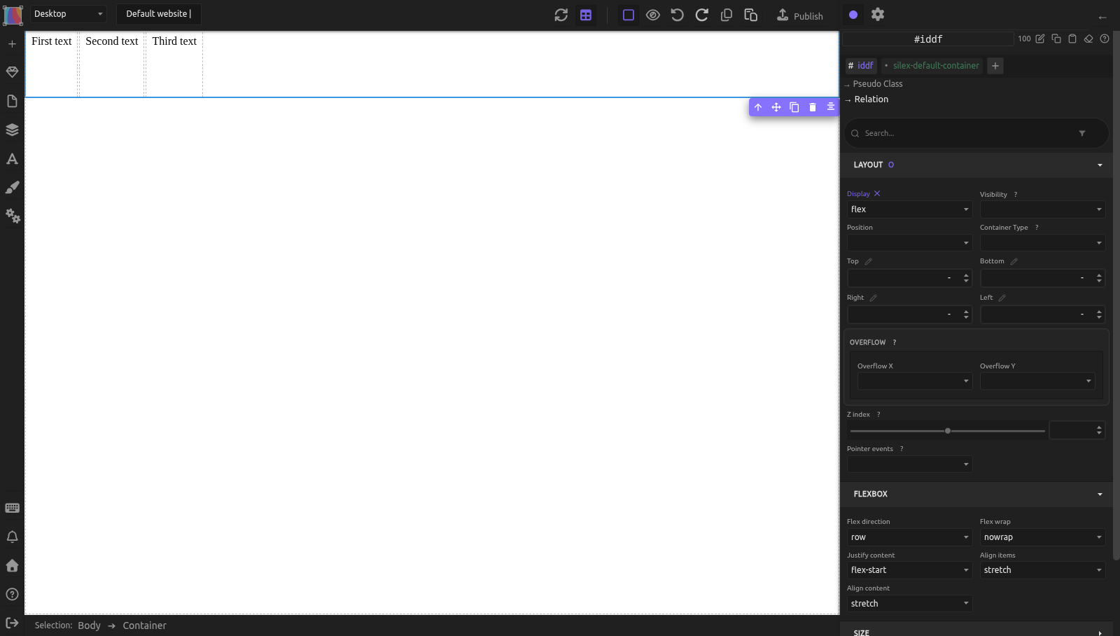
- In the Style panel, set Display to Flex (Layout sector). A Flexbox sector then appears with the flex settings
The children immediately line up horizontally. That's the core idea of Flexbox: you turn a container into a flex container, and its direct children follow your layout rules. Only direct children are affected — grandchildren stay in their own flow.
Try it now: open Silex, create a new page, add a Container with three Text blocks inside. Select the Container, set Display to Flex. Watch the text blocks jump side by side.
Choosing a direction
Flex-direction controls which way children flow.
Row (the default) — left to right. Use it for navigation bars, card layouts, anything horizontal.
Column — top to bottom. Looks the same as default stacking, but now you can use all the flex alignment tools. If you enable Flex and nothing seems to change, this is probably why — try switching to Row.
Understanding the two axes
This is the most important concept to grasp. Every flex container has two axes:
- The main axis runs in the direction of Flex-direction. In a row, that's horizontal (left → right). In a column, that's vertical (top → bottom).
- The cross axis runs perpendicular. In a row, that's vertical. In a column, that's horizontal.
Why does this matter? Because the two alignment properties each control a different axis:
- Justify = main axis (the direction items flow)
- Align = cross axis (the other direction)
Centering and distributing space
Justify-content distributes items along the main axis:
flex-start(default) — items packed at the startflex-end— items packed at the endcenter— items grouped in the middlespace-between— first item at start, last at end, equal gaps in betweenspace-around/space-evenly— equal space around or between all itemsstretch— items stretch to fill the line (mainly useful in grid contexts)
Align-items positions items along the cross axis:
flex-start— items hug the start edge (top in a row)flex-end— items hug the end edge (bottom in a row)center— items centeredstretch(default) — items stretch to match the tallest onebaseline— items align on their text baseline (useful when items have different font sizes)
To perfectly center something: Justify-content center + Align-items center. Done.
Logo left, links right: Justify-content space-between + Align-items center.
Wrapping onto multiple lines
By default, Flex-wrap is nowrap — all children squeeze onto one line, even if they shrink. Set Flex-wrap to wrap and they'll flow to the next row when they run out of room. Wrap-reverse stacks new lines above.
This is how you build a card grid: give each card a fixed width, enable wrap, and cards flow naturally into rows — fewer per row on smaller screens, no breakpoints needed.
Controlling spacing with gaps
Column-gap adds horizontal space between children. Row-gap adds vertical space between lines (when wrap is enabled). Both default to normal (no gap). Set them on the container.
Example: Column-gap 24px puts 24 pixels between each item — no space on the outer edges. Cleaner than margin because it doesn't double up or affect the first/last item.
Making one element grow or shrink
These properties go on individual children — the Style panel shows them when you select an element inside a flex container.
Flex-grow tells a child how much leftover space to take. Default is 0 (keep natural size). Set to 1 and the child expands to fill whatever room is left after other children take their space.
Flex-shrink — can this child get smaller when space is tight? Default is 1 (yes). Set to 0 to prevent it.
Flex-basis — the starting size before grow/shrink kick in. Similar to width in a row or height in a column, but flex-aware. Use auto for content size.
Sidebar + main content: sidebar gets Flex-basis 250px and Flex-grow 0. Main area gets Flex-grow 1. The sidebar stays at 250px, the main area fills the rest — and adapts when the window resizes.
Overriding alignment for one item
Align-self overrides the container's Align-items for one specific child. It accepts the same values: auto (follow the container), flex-start, flex-end, center, stretch, baseline.
A row of buttons all centered vertically (Align-items: center), but you want a small icon at the top? Set that icon's Align-self to flex-start.
Practical example: card grid with navigation
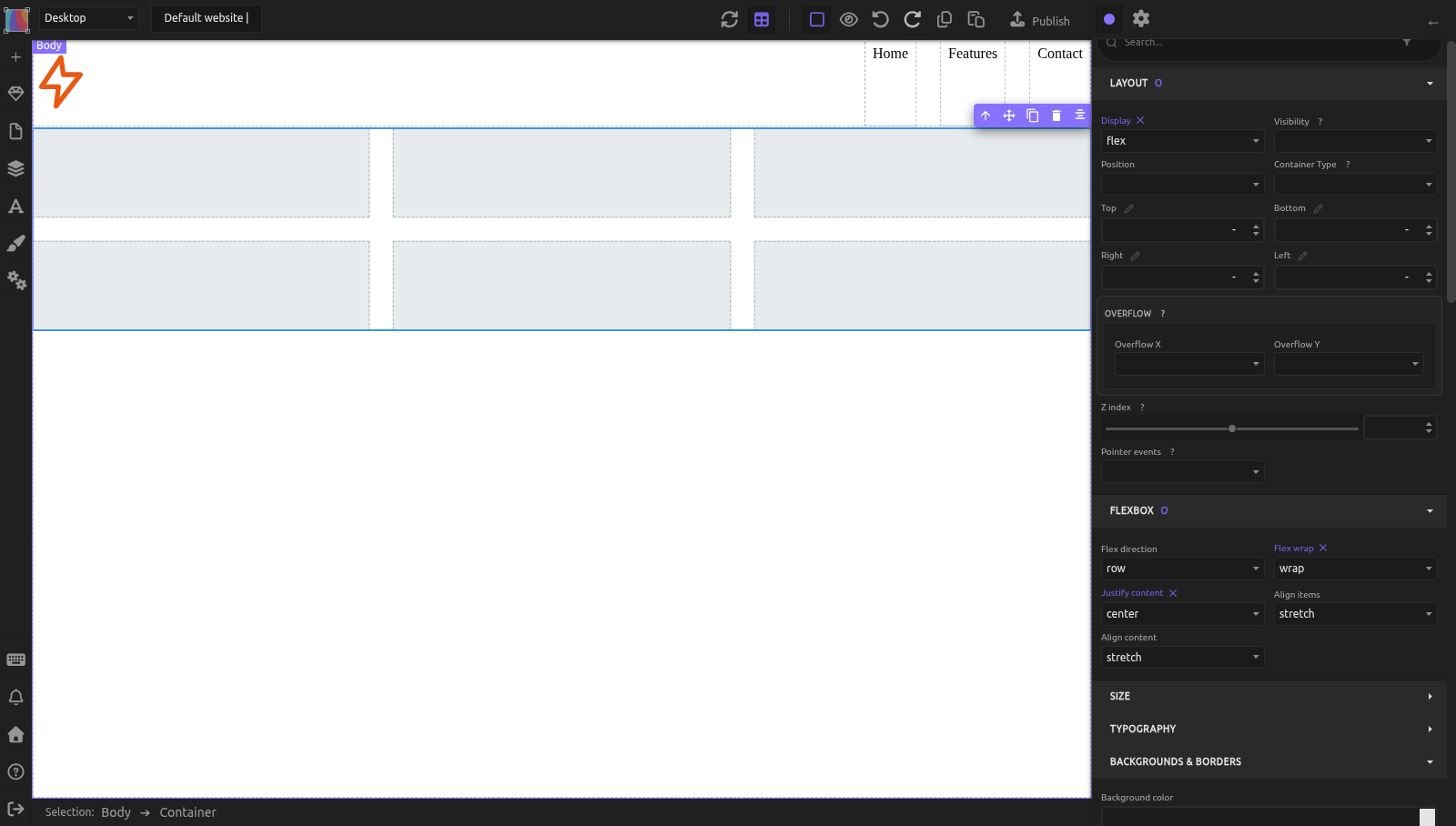
Navigation bar:
- Add a Container — this is the nav container
- Inside it: an Image (logo) and another Container (for links), with a few Text blocks inside
- Nav container: Display Flex, Justify-content space-between, Align-items center
- Links Container: Display Flex, Column-gap 24px (Effects sector)
Logo pushes left, links push right, everything vertically centered.
Card grid below it:
- Add a Container below the nav — this is the cards container
- Add one Container inside it — the first card
- Cards container: Display Flex, Flex-wrap wrap, Justify-content center, Column-gap 24px, Row-gap 24px
- Select the card. In the selector area at the top of the right panel, click + and type
card: the class is added and becomes the target of your styles (.card) - Style
.card: Flex-basis 300px, Flex-grow 1 (and a background color to see it). An empty card has no width in the flex container: select it in the Layers panel. - With the card selected, click Copy, then Paste five times: the copies have the
cardclass, so they share its styles. That makes 6 cards
To give a class to cards that already exist, select them one by one and add the class to each. Selecting several elements at once does not work well yet: you cannot add a class to all of them, and the styles go to the classes they share, like silex-default-container, which every Container of the site has. This is a known bug, see issue #1907.
On wide screens: 3 cards per row. Narrower: 2, then 1. Consistent gaps, no breakpoints.
Common mistakes
- Applying flex to the child instead of the parent. The parent is the flex container — it controls the layout. Only direct children are affected.
- Confusing Justify-content and Align-items. Remember: Justify = main axis (the direction items flow), Align = cross axis (the other direction). In a row, Justify is horizontal and Align is vertical.
- Using margin for spacing instead of gaps. Column-gap and Row-gap are simpler — no double-margins, no extra space on edges.
- Forgetting wrap for card layouts. Without it, cards shrink to fit one line.
- Expecting flex to affect grandchildren. Flex only applies to the container's direct children. Nested elements need their own flex container.
Learn more
- MDN: CSS Flexible Box Layout — full reference
- MDN: Flexbox basics — interactive beginner tutorial
- Tailwind CSS Support — vote for alternative layout options on the roadmap
- The box model — understanding padding, margin, and how they interact with flex gaps
- Positioning — when to use absolute/fixed positioning instead of flex
- Responsive design — combining Flex-wrap with breakpoints for responsive layouts
Advanced: reordering, reverse, and multi-line alignment
Reordering visually
Order changes where a child appears visually without changing HTML. Lower numbers come first (default 0). Set an image's Order to -1 to make it appear first visually.
Reverse directions
Row-reverse and Column-reverse (values of Flex-direction) flip the visual order. Use cautiously — screen readers still follow the HTML order, so a mismatch can confuse users who navigate by keyboard or assistive technology.
Aligning multiple wrapped lines
When Flex-wrap is enabled and items span several rows, Align-content controls how those rows are distributed along the cross axis.
Values: flex-start, flex-end, center, space-between, space-around, stretch.
This only takes effect with multiple lines. Single-line containers ignore it.
Inline flex
Inline flex (in the Display dropdown) works exactly like Flex, but the container itself behaves as an inline element — it sits alongside text instead of taking the full width. Useful for a small group of icons inside a paragraph.
Reference: all flex properties
Container properties
Set on the parent element (Display: Flex or Inline flex).
| Property | Values | MDN |
|---|---|---|
| Display | flex, inline-flex |
link |
| Flex-direction | row, row-reverse, column, column-reverse |
link |
| Flex-wrap | nowrap, wrap, wrap-reverse |
link |
| Justify-content | flex-start, flex-end, center, space-between, space-around, space-evenly, stretch |
link |
| Align-items | flex-start, flex-end, center, stretch, baseline |
link |
| Align-content | flex-start, flex-end, center, space-between, space-around, stretch |
link |
| Column-gap | length (px, %, em, rem, vh, vw, cqi, cqb, cqw, cqh, cqmin, cqmax), normal |
link |
| Row-gap | length (same units), normal |
link |
Child properties
Set on elements inside a flex container.
| Property | Values | MDN |
|---|---|---|
| Flex-grow | number (default 0) |
link |
| Flex-shrink | number (default 1) |
link |
| Flex-basis | length, auto |
link |
| Order | integer (default 0) |
link |
| Align-self | auto, flex-start, flex-end, center, stretch, baseline |
link |
Quiz
Q1: You want three cards side by side. What's the first thing to set on their parent?
- A) Flex-grow: 1 on each card
- B) Display: Flex on the parent
- C) Column-gap on the parent
Answer
B) Display: Flex on the parent — Flex always starts on the container. Grow and gap come after.
Q2: Your cards are squished on one line instead of wrapping to the next row. What did you forget?
- A) Flex-grow
- B) Flex-wrap: wrap
- C) Align-content
Answer
B) Flex-wrap: wrap — without it, Flex-wrap defaults to nowrap and children shrink to fit.
Q3: You have a sidebar (250px) and a main content area. How do you make the main area fill the remaining space?
- A) Set the main area's width to 100%
- B) Set the main area's Flex-grow to 1
- C) Set Justify-content to stretch on the container
Answer
B) Set the main area's Flex-grow to 1 — this tells it to expand into all available space. The sidebar keeps its size because its Flex-grow is 0.
Q4: You have a row of items and you want them vertically centered. Which property do you use?
- A) Justify-content: center
- B) Align-items: center
- C) Flex-direction: column
Answer
B) Align-items: center — In a row, Align-items controls the vertical (cross) axis. Justify-content controls the horizontal (main) axis.
Q5: What's the difference between Column-gap and margin?
- A) Column-gap also adds space outside the first and last items
- B) Column-gap only adds space between items, not on the outer edges
- C) Column-gap only works in columns, not rows
Answer
B) Column-gap only adds space between items, not on the outer edges — margin adds space around every element, including the first and last.