Keyboard navigation and focus
Every interactive element on your site must be usable without a mouse. Keyboard users, screen reader users, and people with motor impairments all rely on keyboard navigation to move through a page.
Two guiding principles:
- If you can click it, you must be able to reach and activate it with the keyboard. Tab to focus, Enter or Space to activate, Escape to dismiss.
- The focus indicator must be visible. Users need to see where they are on the page at all times.
How keyboard navigation works
When a user presses Tab, the browser moves focus to the next interactive element in the page. Shift+Tab moves backward. Enter activates links and buttons. Space toggles checkboxes and activates buttons.
The order in which elements receive focus follows the DOM order -- the order elements appear in the HTML source. In Silex, this is the order you see in the Layers panel (left sidebar, Shift+L). The top-to-bottom order in Layers is the Tab order on the published page.
This means layout and tab order must match. If you use CSS positioning to visually rearrange elements, the keyboard order still follows the DOM. A button that appears at the top of the page but is last in the Layers panel will be the last element a keyboard user reaches.
Fixing tab order
If the tab order does not match the visual order:
- Open the Layers panel (Shift+L)
- Drag elements to reorder them so the DOM order matches the visual reading order
- Test by pressing Tab through the page
Do not use tabindex values greater than 0 to force a custom order. This creates maintenance problems and confuses assistive technology. Instead, fix the DOM order.
Focus indicators
When an element receives keyboard focus, browsers show a default outline -- typically a blue or black ring. This outline is essential for keyboard users to know where they are.
Never remove outlines without providing an alternative. The CSS rule outline: none is one of the most common accessibility mistakes on the web.
If you want to style focus indicators to match your design:
- Select the element (link, button, input)
- In the Style panel, click Pseudo Class under the selector and choose
focus(orfocus-visible): the selector becomes e.g.#my-link:focus - Style the Outline (color, width, style) or use Box-shadow as an alternative. Both are in the Backgrounds & borders sector; typing
outlinein the Style panel's Search field shows only the Outline fields - Make sure the focus style is clearly visible against the element's background
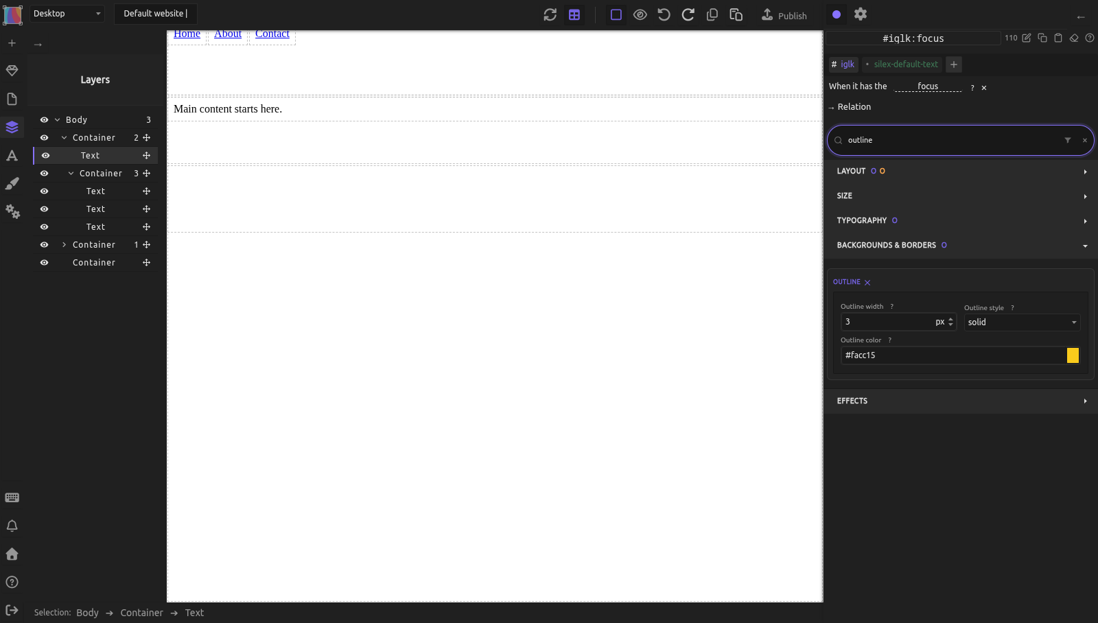
Tip: Use :focus-visible instead of :focus if you want the focus indicator to appear only for keyboard users (not mouse clicks). This gives the best of both worlds: keyboard users see the focus ring, mouse users don't.
WCAG requirements for focus
- 2.4.7 Focus Visible (Level AA): Focus indicators must be visible.
- 2.4.11 Focus Appearance (Level AA in WCAG 2.2): The focus indicator must have sufficient contrast and size.
Skip links
Screen reader and keyboard users navigate sequentially. On every page, they must Tab through the header, logo, and navigation before reaching the main content. A skip link lets them jump directly to the main content.
A skip link is a hidden link at the very top of the page that becomes visible on focus:
- Add a Text block as the very first child of the
body(or inside your header Symbol, before the nav) - Set its text to "Skip to main content"
- In the Element settings (gear icon at the top of the right panel), set its Link Type to
URLand the URL to#main(or whatever ID your main content container has): the Text becomes a link - Give your main content container that ID, and make it focusable:
- Select the main content container
- In the Element settings (gear icon), set the ID field to
main - In the Attributes section, click +, name the attribute
tabindexand set its value to-1. Without it, Enter scrolls to the main content but the keyboard focus stays at the top of the page - Style the skip link: position it off-screen by default, and make it visible on
:focus: - Default state: Position
absolute, Top-100px(or use a class that hides it visually) :focusstate: Top0px, with a visible background and text color
When a keyboard user presses Tab, the skip link appears. Pressing Enter jumps them to the main content. Test it on the published page: in the editor, even in preview, Tab doesn't move the focus.

Links and buttons
Use descriptive text
Screen reader users often navigate by listing all links on a page. If every link says "Click here" or "Read more," the list is useless.
| Bad | Good |
|---|---|
| "Click here" | "Download the annual report (PDF, 2 MB)" |
| "Read more" | "Read more about responsive design" |
| "Learn more" | "Learn more about CMS integration" |
| URL as link text | Descriptive text instead |
Links vs. buttons
- Links (
<a>) navigate to a new page or location. They are activated with Enter. - Buttons (
<button>) perform an action (submit a form, toggle a menu, open a dialog). They are activated with Enter or Space.
In Silex, for a button, set Tag name to BUTTON in the Element settings. For a link, set the Type of Link to URL in the Element settings and type the address: the element becomes an <a> (the Tag name list has no A). Do not use a styled Div as a clickable element -- it will not receive keyboard focus or be announced by screen readers.
Landmark navigation
Screen reader users can jump between landmark regions -- header, nav, main, aside, footer. These are created automatically when you use semantic HTML tags.
If your page has multiple nav elements (primary menu, footer links), distinguish them with aria-label:
- Select the nav element
- In the Element settings (gear icon), Attributes section, click +
- Name the attribute
aria-label - Set the value to a descriptive name (e.g., "Primary navigation" or "Footer links")
Screen readers will announce "Primary navigation, navigation landmark" instead of just "navigation," helping users distinguish between regions. See ARIA attributes and roles for more on adding ARIA attributes.
Practical example: accessible navigation with skip link
You are building a site with a header, primary nav, main content, and footer.
- Create the skip link:
- Add a Text block as the first child inside the header Symbol
- Set its text: "Skip to main content"
- In the Element settings, set its Link to URL
#main-content -
Style: Position absolute, off-screen. On
:focus: visible, high contrast -
Mark the main content:
- Select the
maincontainer - In the Element settings, set ID to
main-content -
In the Attributes section, add
tabindex=-1 -
Label the navigation:
- Select the
navelement in the header -
In the Attributes section, add
aria-label=Primary navigation -
Check the Layers panel:
- Verify the DOM order: skip link > logo > nav > main > footer
-
This matches the visual reading order
-
Test on the published page: Tab through the page. The skip link appears first. Press Enter -- focus jumps to the main content area.
Common mistakes
- Removing focus outlines for aesthetics. Keyboard users lose their only navigation indicator. Style the outline instead of removing it.
- Visual order does not match DOM order. CSS positioning can move elements visually, but keyboard users follow DOM order. Keep them aligned using the Layers panel.
- Using Divs as buttons. A styled Div is not keyboard-focusable and is not announced as a button. Use
<button>or<a>elements. - "Click here" and "Read more" as link text. These are meaningless out of context. Write link text that describes the destination.
- No skip link. Keyboard users must Tab through the entire header and navigation on every page load. A skip link takes one minute to build and saves them every visit.
- Multiple nav landmarks without labels. Screen readers list all landmarks -- without
aria-label, the user sees "navigation, navigation, navigation" with no way to tell them apart.
Learn more
- MDN: Keyboard-navigable JavaScript widgets -- keyboard interaction patterns
- MDN: :focus-visible -- keyboard-only focus styling
- WebAIM: Skip Navigation Links -- skip link patterns
- WebAIM: Links and Hypertext -- accessible link text
- Semantic HTML -- semantic tags and landmarks
- Selectors and classes -- styling :focus and :focus-visible states
- Colors and backgrounds -- outline and focus styling
Reference: WCAG keyboard and navigation requirements
| Criterion | Level | Requirement |
|---|---|---|
| 2.1.1 Keyboard | A | All functionality available from a keyboard |
| 2.1.2 No Keyboard Trap | A | Users can navigate away from any element using the keyboard |
| 2.4.1 Bypass Blocks | A | Provide a mechanism (skip link) to bypass repeated content |
| 2.4.3 Focus Order | A | Focus order preserves meaning and operability |
| 2.4.4 Link Purpose (In Context) | A | Link purpose can be determined from link text or context |
| 2.4.7 Focus Visible | AA | Focus indicator is visible |
| 2.4.11 Focus Appearance | AA | Focus indicator has sufficient size and contrast |
Quiz
Q1: A user presses Tab and nothing visible happens on the page. What is likely wrong?
- A) The user's keyboard is broken
- B) Focus outlines have been removed with
outline: none - C) The page has no interactive elements
Answer
B) Focus outlines have been removed with outline: none -- This is one of the most common accessibility mistakes. Focus is moving, but the user cannot see where. Restore or restyle the outline.
Q2: You have three links that all say "Read more." A screen reader user lists all links on the page. What do they see?
- A) Three links with clear destinations
- B) "Read more, Read more, Read more" -- no way to tell them apart
- C) The links are automatically labeled by the browser
Answer
B) "Read more, Read more, Read more" -- link text must be descriptive on its own. Change them to "Read more about [topic]" or use aria-label to provide context.
Q3: A button appears at the top of the page visually, but it is the last element in the Layers panel. When a keyboard user presses Tab, when do they reach it?
- A) First, because it's visually at the top
- B) Last, because Tab order follows the DOM order
- C) It depends on the CSS position property
Answer
B) Last, because Tab order follows the DOM order -- CSS positioning changes visual appearance but not keyboard navigation order. Reorder the element in the Layers panel to fix it.