Navigation au clavier et focus
Chaque élément interactif de votre site doit être utilisable sans souris. Les utilisateurs au clavier, les utilisateurs de lecteur d'écran et les personnes avec des troubles moteurs s'appuient tous sur la navigation au clavier pour parcourir une page.
Deux principes directeurs :
- Si vous pouvez cliquer dessus, vous devez pouvoir l'atteindre et l'activer au clavier. Tab pour cibler, Entrée ou Espace pour activer, Échap pour fermer.
- L'indicateur de focus doit être visible. Les utilisateurs doivent voir où ils se trouvent sur la page à tout moment.
Comment fonctionne la navigation au clavier
Quand un utilisateur appuie sur Tab, le navigateur déplace le focus vers l'élément interactif suivant de la page. Maj+Tab revient en arrière. Entrée active les liens et les boutons. Espace coche les cases et active les boutons.
L'ordre dans lequel les éléments reçoivent le focus suit l'ordre du DOM -- l'ordre dans lequel les éléments apparaissent dans le code source HTML. Dans Silex, c'est l'ordre que vous voyez dans le panneau Layers (barre latérale gauche, Maj+L). L'ordre de haut en bas dans Layers correspond à l'ordre de tabulation sur la page publiée.
Cela signifie que la mise en page et l'ordre de tabulation doivent correspondre. Si vous utilisez le positionnement CSS pour réorganiser visuellement des éléments, l'ordre au clavier suit toujours le DOM. Un bouton qui apparaît en haut de la page mais qui est en dernier dans le panneau Layers sera le dernier élément qu'un utilisateur au clavier atteindra.
Corriger l'ordre de tabulation
Si l'ordre de tabulation ne correspond pas à l'ordre visuel :
- Ouvrez le panneau Layers (Maj+L)
- Faites glisser les éléments pour les réordonner afin que l'ordre du DOM corresponde à l'ordre de lecture visuel
- Testez en tabulant à travers la page
N'utilisez pas de valeurs tabindex supérieures à 0 pour forcer un ordre personnalisé. Cela crée des problèmes de maintenance et perturbe les technologies d'assistance. Corrigez plutôt l'ordre du DOM.
Indicateurs de focus
Quand un élément reçoit le focus clavier, les navigateurs affichent un contour (outline) par défaut -- généralement un anneau bleu ou noir. Ce contour est essentiel pour que les utilisateurs au clavier sachent où ils se trouvent.
Ne supprimez jamais les contours sans fournir d'alternative. La règle CSS outline: none est l'une des erreurs d'accessibilité les plus courantes sur le web.
Si vous voulez styliser les indicateurs de focus pour les accorder à votre design :
- Sélectionnez l'élément (lien, bouton, champ)
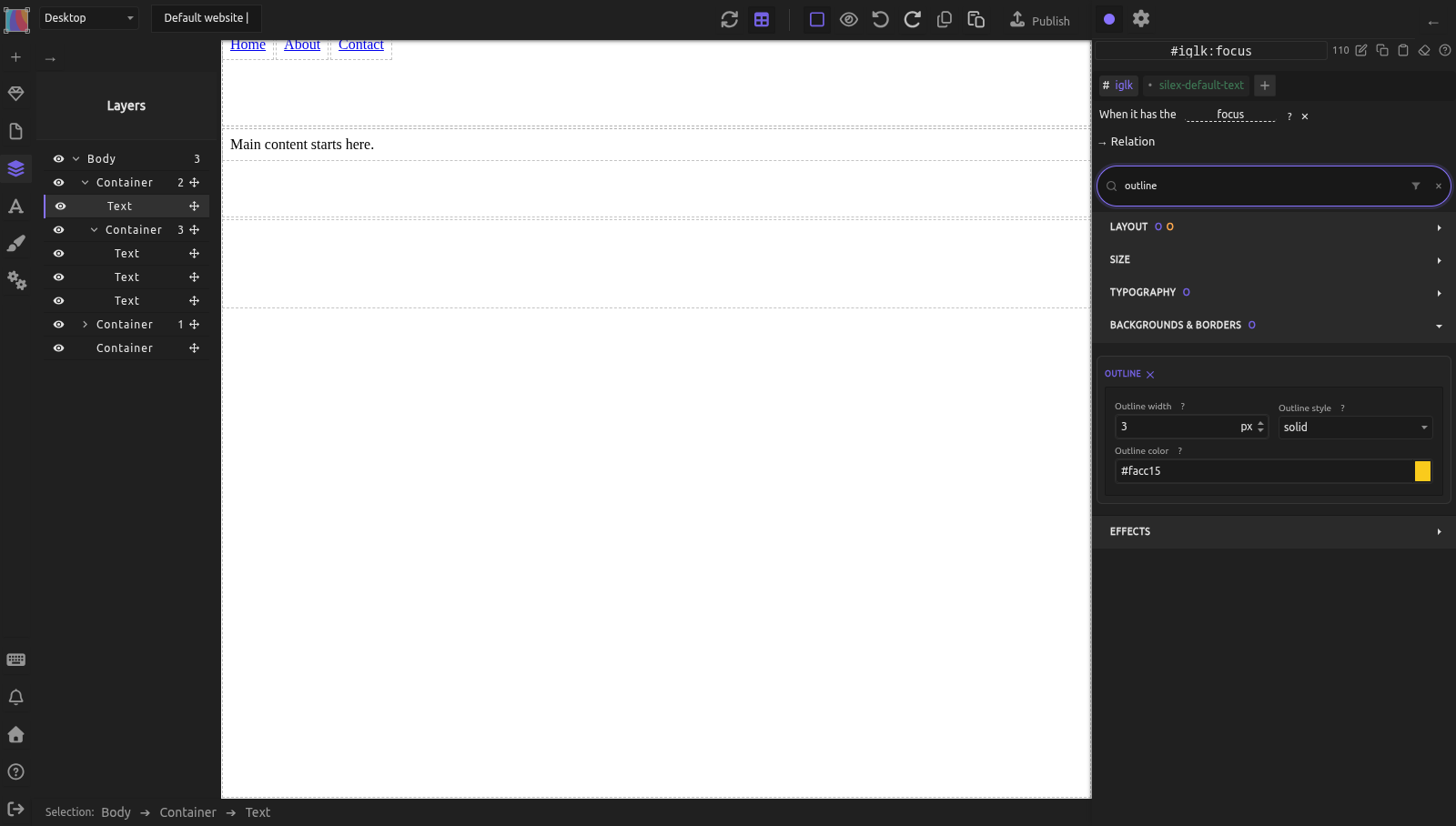
- Dans le panneau Style, cliquez sur Pseudo Class sous le sélecteur et choisissez
focus(oufocus-visible) : le sélecteur devient par ex.#mon-lien:focus(voir pseudo-classes) - Stylisez le contour (Outline) (couleur, largeur, style) ou utilisez Box-shadow comme alternative. Les deux sont dans le secteur Backgrounds & borders ; taper
outlinedans le champ Search du panneau Style n'affiche que les champs Outline - Assurez-vous que le style de focus est nettement visible sur le fond de l'élément
Astuce : utilisez :focus-visible au lieu de :focus si vous voulez que l'indicateur de focus n'apparaisse que pour les utilisateurs au clavier (pas les clics de souris). Vous obtenez le meilleur des deux mondes : les utilisateurs au clavier voient l'anneau de focus, les utilisateurs à la souris non.
Exigences WCAG sur le focus
- 2.4.7 Visibilité du focus (Niveau AA) : les indicateurs de focus doivent être visibles.
- 2.4.11 Apparence du focus (Niveau AA dans WCAG 2.2) : l'indicateur de focus doit avoir un contraste et une taille suffisants.
Liens d'évitement
Les utilisateurs de lecteur d'écran et de clavier naviguent de façon séquentielle. Sur chaque page, ils doivent tabuler à travers l'en-tête, le logo et la navigation avant d'atteindre le contenu principal. Un lien d'évitement leur permet de sauter directement au contenu principal.
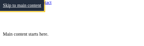
Un lien d'évitement est un lien caché tout en haut de la page qui devient visible au focus :
- Ajoutez un bloc Text comme tout premier enfant du
body(ou à l'intérieur de votre Symbol d'en-tête, avant la nav) - Définissez son texte à « Skip to main content »
- Dans les réglages de l'élément (icône engrenage en haut du panneau de droite), réglez le Type de Link sur
URLet l'URL sur#main(ou l'ID de votre conteneur de contenu principal) : le Text devient un lien - Donnez cet ID à votre conteneur de contenu principal, et rendez-le focalisable :
- Sélectionnez le conteneur de contenu principal
- Dans les réglages de l'élément (icône engrenage), remplissez le champ ID avec
main - Dans la section Attributes, cliquez sur +, nommez l'attribut
tabindexet donnez-lui la valeur-1. Sans lui, Entrée fait défiler jusqu'au contenu principal mais le focus clavier reste en haut de la page - Stylisez le lien d'évitement : positionnez-le hors écran par défaut, et rendez-le visible en
:focus: - État par défaut : Position
absolute, Top-100px(ou utilisez une classe qui le masque visuellement) - État
:focus: Top0px, avec une couleur de fond et de texte visible
Quand un utilisateur au clavier appuie sur Tab, le lien d'évitement apparaît. Appuyer sur Entrée le mène au contenu principal. Testez-le sur la page publiée : dans l'éditeur, même en aperçu, Tab ne déplace pas le focus.
Liens et boutons
Utilisez un texte descriptif
Les utilisateurs de lecteur d'écran naviguent souvent en listant tous les liens d'une page. Si chaque lien dit « Cliquez ici » ou « En savoir plus », la liste est inutile.
| Mauvais | Bon |
|---|---|
| « Cliquez ici » | « Télécharger le rapport annuel (PDF, 2 Mo) » |
| « En savoir plus » | « En savoir plus sur le design responsive » |
| « En savoir plus » | « En savoir plus sur l'intégration CMS » |
| L'URL comme texte du lien | Un texte descriptif à la place |
Liens ou boutons
- Les liens (
<a>) mènent à une nouvelle page ou à un autre emplacement. Ils s'activent avec Entrée. - Les boutons (
<button>) effectuent une action (soumettre un formulaire, ouvrir un menu, ouvrir une boîte de dialogue). Ils s'activent avec Entrée ou Espace.
Dans Silex, pour un bouton, réglez Tag name sur BUTTON dans les réglages de l'élément. Pour un lien, réglez le Type de Link sur URL dans les réglages de l'élément et tapez l'adresse : l'élément devient un <a> (la liste Tag name n'a pas de A). N'utilisez pas un Div stylisé comme élément cliquable -- il ne recevra pas le focus clavier et ne sera pas annoncé par les lecteurs d'écran.
Navigation par repères
Les utilisateurs de lecteur d'écran peuvent sauter entre les régions repères (landmarks) -- header, nav, main, aside, footer. Ces repères sont créés automatiquement lorsque vous utilisez des balises HTML sémantiques.
Si votre page a plusieurs éléments nav (menu principal, liens de pied de page), distinguez-les avec aria-label :
- Sélectionnez l'élément nav
- Dans les réglages de l'élément (icône engrenage), section Attributes, cliquez sur +
- Nommez l'attribut
aria-label - Définissez la valeur avec un nom descriptif (par exemple, « Primary navigation » ou « Footer links »)
Les lecteurs d'écran annonceront « Primary navigation, navigation landmark » au lieu de seulement « navigation », aidant les utilisateurs à distinguer les régions. Voir Attributs et rôles ARIA pour en savoir plus sur l'ajout d'attributs ARIA.
Exemple pratique : navigation accessible avec lien d'évitement
Vous construisez un site avec un en-tête, une nav principale, un contenu principal et un pied de page.
- Créez le lien d'évitement :
- Ajoutez un bloc Text comme premier enfant à l'intérieur du Symbol d'en-tête
- Définissez son texte : « Skip to main content »
- Dans les réglages de l'élément, réglez son Link sur URL
#main-content -
Style : Position absolute, hors écran. En
:focus: visible, fort contraste -
Marquez le contenu principal :
- Sélectionnez le conteneur
main - Dans les réglages de l'élément, réglez ID sur
main-content -
Dans la section Attributes, ajoutez
tabindex=-1 -
Étiquetez la navigation :
- Sélectionnez l'élément
navdans l'en-tête -
Dans la section Attributes, ajoutez
aria-label=Primary navigation -
Vérifiez le panneau Layers :
- Vérifiez l'ordre du DOM : lien d'évitement > logo > nav > main > footer
-
Cela correspond à l'ordre de lecture visuel
-
Testez sur la page publiée : tabulez à travers la page. Le lien d'évitement apparaît en premier. Appuyez sur Entrée -- le focus saute vers la zone de contenu principal.
Erreurs courantes
- Supprimer les contours de focus pour l'esthétique. Les utilisateurs au clavier perdent leur seul indicateur de navigation. Stylisez le contour au lieu de le supprimer.
- L'ordre visuel ne correspond pas à l'ordre du DOM. Le positionnement CSS peut déplacer les éléments visuellement, mais les utilisateurs au clavier suivent l'ordre du DOM. Gardez-les alignés à l'aide du panneau Layers.
- Utiliser des Div comme boutons. Un Div stylisé n'est pas focusable au clavier et n'est pas annoncé comme un bouton. Utilisez des éléments
<button>ou<a>. - « Cliquez ici » et « En savoir plus » comme texte de lien. Ces formulations n'ont aucun sens hors contexte. Rédigez un texte de lien qui décrit la destination.
- Pas de lien d'évitement. Les utilisateurs au clavier doivent tabuler à travers tout l'en-tête et la navigation à chaque chargement de page. Un lien d'évitement prend une minute à construire et leur en fait gagner à chaque visite.
- Plusieurs repères nav sans labels. Les lecteurs d'écran listent tous les repères -- sans
aria-label, l'utilisateur voit « navigation, navigation, navigation » sans pouvoir les distinguer.
Pour aller plus loin
- MDN : Widgets JavaScript navigables au clavier -- modèles d'interaction au clavier
- MDN : :focus-visible -- style de focus au clavier uniquement
- WebAIM : Skip Navigation Links -- modèles de liens d'évitement
- WebAIM : Links and Hypertext -- texte de lien accessible
- HTML sémantique -- balises sémantiques et repères
- Sélecteurs et classes -- styliser les états :focus et :focus-visible
- Couleurs et arrière-plans -- style du contour et du focus
Référence : exigences WCAG sur le clavier et la navigation
| Critère | Niveau | Exigence |
|---|---|---|
| 2.1.1 Clavier | A | Toutes les fonctionnalités sont accessibles au clavier |
| 2.1.2 Pas de piège au clavier | A | Les utilisateurs peuvent quitter n'importe quel élément au clavier |
| 2.4.1 Contourner des blocs | A | Fournir un mécanisme (lien d'évitement) pour contourner le contenu répété |
| 2.4.3 Ordre du focus | A | L'ordre du focus préserve le sens et l'utilisabilité |
| 2.4.4 Finalité des liens (selon le contexte) | A | La finalité d'un lien peut se déduire de son texte ou de son contexte |
| 2.4.7 Visibilité du focus | AA | L'indicateur de focus est visible |
| 2.4.11 Apparence du focus | AA | L'indicateur de focus a une taille et un contraste suffisants |
Quiz
Q1 : Un utilisateur appuie sur Tab et rien de visible ne se passe sur la page. Quel est le problème probable ?
- A) Le clavier de l'utilisateur est cassé
- B) Les contours de focus ont été supprimés avec
outline: none - C) La page n'a aucun élément interactif
Réponse
B) Les contours de focus ont été supprimés avec outline: none -- c'est l'une des erreurs d'accessibilité les plus courantes. Le focus se déplace, mais l'utilisateur ne peut pas voir où. Rétablissez ou restylisez le contour.
Q2 : Vous avez trois liens qui disent tous « En savoir plus ». Un utilisateur de lecteur d'écran liste tous les liens de la page. Que voit-il ?
- A) Trois liens avec des destinations claires
- B) « En savoir plus, En savoir plus, En savoir plus » -- impossible de les distinguer
- C) Les liens sont automatiquement étiquetés par le navigateur
Réponse
B) « En savoir plus, En savoir plus, En savoir plus » -- le texte du lien doit être descriptif par lui-même. Changez-les en « En savoir plus sur [sujet] » ou utilisez aria-label pour fournir du contexte.
Q3 : Un bouton apparaît visuellement en haut de la page, mais c'est le dernier élément du panneau Layers. Quand un utilisateur au clavier appuie sur Tab, à quel moment l'atteint-il ?
- A) En premier, parce qu'il est visuellement en haut
- B) En dernier, parce que l'ordre de tabulation suit l'ordre du DOM
- C) Cela dépend de la propriété CSS position
Réponse
B) En dernier, parce que l'ordre de tabulation suit l'ordre du DOM -- le positionnement CSS change l'apparence visuelle mais pas l'ordre de navigation au clavier. Réordonnez l'élément dans le panneau Layers pour corriger cela.