Breakpoints
A breakpoint is a screen width where your design changes. Instead of building one fixed layout and hoping it works everywhere, you adapt the layout at specific widths — stacking columns, resizing text, or hiding elements. Silex has four devices with fixed breakpoints, and you switch between them with the device dropdown in the top toolbar.
Two things to keep in mind:
- Breakpoints work top-down. The desktop view is your base. Styles you set at narrower breakpoints override the desktop styles, but only at that width and below.
- You are not resizing the browser. You are telling the editor to show you how the site looks at a specific width. The device dropdown simulates screen sizes inside the canvas.
How breakpoints work in Silex
Silex follows a desktop-first approach. Your default styles apply to all screen sizes. When you select a narrower device in the toolbar, you are adding overrides inside a @media rule that only activates when the viewport is at or below that width.
Under the hood, each breakpoint generates a max-width media query. For example, any style you set while the Tablet device is active gets wrapped in @media (max-width: 992px).
This means:
- Styles set on the desktop device have no media query — they apply everywhere.
- Styles set on smaller devices only kick in when the screen is narrow enough.
- If you do not override a property at a smaller breakpoint, the desktop value carries through.
Using the device dropdown
The device preview is a dropdown at the left of the top toolbar. It contains four devices: Desktop, Tablet, Mobile Landscape, and Mobile Portrait. Selecting one narrows the canvas so you can see and edit the layout at that size.
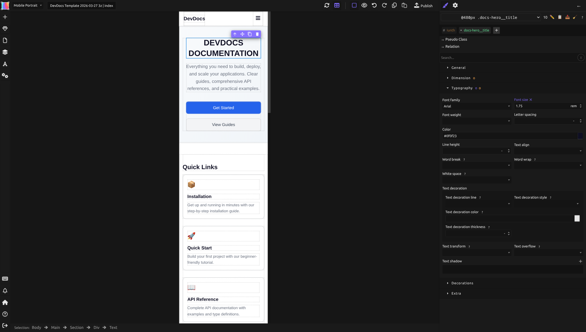
When you select a device and change a style in the Style panel, that change is scoped to the corresponding media query. The selector at the top of the Style panel shows the breakpoint you are editing, for example @992px in front of the selector on Tablet — pay attention to this before making changes.
To add or adjust breakpoint-specific styles:
- Select the device in the dropdown for the screen size you want to target
- Select the element you want to adjust
- Change its styles in the Style panel — those changes apply only at that breakpoint and narrower
- Switch back to the desktop device to confirm your base styles are intact
Choosing your breakpoints
The four devices in the dropdown have these breakpoints:
| Device (in dropdown) | Styles apply at | Canvas width in the editor |
|---|---|---|
| Desktop | all widths (base — no media query) | full width |
| Tablet | 992px and narrower | 770px |
| Mobile Landscape | 768px and narrower | 568px |
| Mobile Portrait | 480px and narrower | 320px |
You can't add a device or change these widths in the editor, and the canvas can't be resized by hand. Start with your desktop design, then check how it looks on each smaller device. Only override styles on the devices where the layout needs to change.
A practical guideline: switch between the devices and look at each one. Where the layout starts looking wrong — text overflows, elements overlap, whitespace becomes awkward — that is where you need an override.
What to adjust at each breakpoint
The most common adjustments at narrower breakpoints:
- Flex-direction: Switch a row to a column so side-by-side elements stack vertically.
- Font-size: Reduce heading sizes so they do not dominate small screens.
- Padding and Margin: Tighten spacing. Generous whitespace on desktop can feel wasteful on mobile.
- Display: Hide decorative elements with
display: noneon mobile, or show mobile-only elements hidden on desktop. - Width: Set fixed-width sidebars to
100%so they take the full screen on small devices. - Column-gap and Row-gap: Reduce gaps between items.
Desktop-first vs mobile-first
Silex uses a desktop-first model: max-width media queries that override the base (desktop) styles at narrower screens. This means you design the full desktop experience first, then simplify for smaller devices.
The alternative — mobile-first — starts with mobile styles and adds complexity at wider screens using min-width queries. Both approaches are valid in CSS, but Silex's DeviceManager generates max-width queries, so the desktop-first workflow is the natural fit.
Breakpoint-specific styles in the Style panel
When you switch devices, the Style panel context changes. You will notice:
- Properties you have not overridden at the current breakpoint show the inherited desktop value in a muted style.
- Properties you change at this breakpoint appear with their new value.
- Removing a breakpoint-specific override restores the inherited desktop value.
This inheritance is automatic. You do not need to re-enter every style at every breakpoint — only the ones that need to change.
Common mistakes
- Editing styles on the wrong device. Always check which device is active before changing styles. If you accidentally set a mobile font size while on the desktop device, it will affect all screen sizes.
- Setting all properties at every breakpoint. Only override what needs to change. Let inheritance do the rest.
- Forgetting the viewport meta tag. Without
<meta name="viewport" content="width=device-width, initial-scale=1.0">, mobile browsers render the page at desktop width and zoom out. Silex adds this tag automatically during publication. - Using fixed pixel widths on containers. A
divset towidth: 960pxwill overflow on any screen narrower than 960px. Usemax-widthor percentage-based widths on outer containers.
Learn more
- MDN: Using media queries — full reference on
@mediarules - MDN: Responsive design — comprehensive guide to responsive techniques
- Responsive techniques — relative units and fluid sizing in Silex
- Testing across devices — previewing your responsive layouts
- Flexbox — combining flex layouts with breakpoints
- The box model — understanding how padding and margin interact with responsive sizing
Advanced: media query details
How GrapesJS stores breakpoints
Each device in the DeviceManager has a name, an optional width (the canvas preview width), and a widthMedia (the max-width value used in the media query). The base device has an empty widthMedia, meaning no media query — styles apply to all sizes.
Overlapping media queries
Because Silex uses max-width, breakpoints cascade downward. A style set at 768px applies to 768px and everything narrower. If you also set a different value at 480px, that takes priority below 480px. The browser picks the most specific matching query.
The viewport meta tag
Silex automatically includes <meta name="viewport" content="width=device-width, initial-scale=1.0"> in published pages. This tells mobile browsers to use the actual device width instead of a virtual 980px viewport. Without it, media queries would never trigger on phones because the browser would report a desktop-width viewport.
CSS Variables across breakpoints
If you use CSS Variables, you can set different values for the same variable at different breakpoints. The CSS Variables panel supports per-device overrides — for example, --spacing-large could be 48px on desktop and 24px on mobile. This is a powerful way to make your entire spacing system responsive with minimal effort.
Reference: available units for responsive values
When setting property values in the Style panel, Silex supports these units:
| Unit | Description |
|---|---|
px |
Absolute pixels. Fixed size regardless of context. |
% |
Percentage of the parent element's corresponding dimension. |
em |
Relative to the element's own font size. |
rem |
Relative to the root (html) font size. Consistent across the page. |
vh |
1% of the viewport height. |
vw |
1% of the viewport width. |
cqi |
1% of the container's inline size (container query unit). |
cqb |
1% of the container's block size (container query unit). |
cqw |
1% of the container's width (container query unit). |
cqh |
1% of the container's height (container query unit). |
cqmin |
The smaller of cqi and cqb. |
cqmax |
The larger of cqi and cqb. |
For responsive design, prefer relative units (%, em, rem, vw, vh) over fixed px where possible. See Responsive techniques for practical guidance on when to use each unit.
Quiz
Q1: You set a heading's font size to 48px on desktop. On the Tablet device, you do not change it. What font size does the heading have on a 900px screen?
- A) The browser default (usually 16px)
- B) 48px, inherited from the desktop styles
- C) 0 — you must set it at every breakpoint
Answer
B) 48px, inherited from the desktop styles — In desktop-first, the base styles apply everywhere unless overridden at a specific breakpoint.
Q2: You want a three-column layout on desktop that becomes a single column on phones. What is the most efficient approach?
- A) Set Flex-direction to row on desktop, then override it to column at the mobile breakpoint
- B) Create two separate sections and hide one on each device
- C) Set all three columns to width 33% and hope they wrap
Answer
A) Set Flex-direction to row on desktop, then override it to column at the mobile breakpoint — One container, one layout change at the breakpoint. Clean and maintainable.
Q3: You accidentally set padding on the desktop device when you meant to set it only for mobile. How do you fix this?
- A) Switch to the mobile device and remove the padding there
- B) Switch to the desktop device and remove the padding, then switch to mobile and add it there
- C) Delete the element and start over
Answer
B) Switch to the desktop device and remove the padding, then switch to mobile and add it there — Desktop styles are the base. You need to fix the base first, then add the override where you want it.
Q4: Your site looks fine in the editor at every breakpoint, but on an actual phone the layout is tiny and zoomed out. What is likely wrong?
- A) The breakpoints are set to the wrong widths
- B) The viewport meta tag is missing
- C) You used the wrong CSS units
Answer
B) The viewport meta tag is missing — Without the viewport meta tag, mobile browsers render at a virtual desktop width. Silex adds this automatically during publication, but if you are testing raw HTML you may need to verify it is present.
Q5: At which widths does a style set on the Mobile Landscape device (768px) apply?
- A) Only exactly at 768px
- B) From 769px to 992px
- C) At 768px and everything narrower (including 480px), unless overridden on Mobile Portrait
Answer
C) At 768px and everything narrower (including 480px), unless overridden on Mobile Portrait — A max-width media query activates at that width and below. A style set on Mobile Portrait (480px) takes priority for screens 480px and narrower.